BRAND IDENTITIES THAT TELL YOUR STORY

LOGO DESIGN BRISBANE

Best Logo Design Brisbane

BRISBANE LOGO DESIGNER

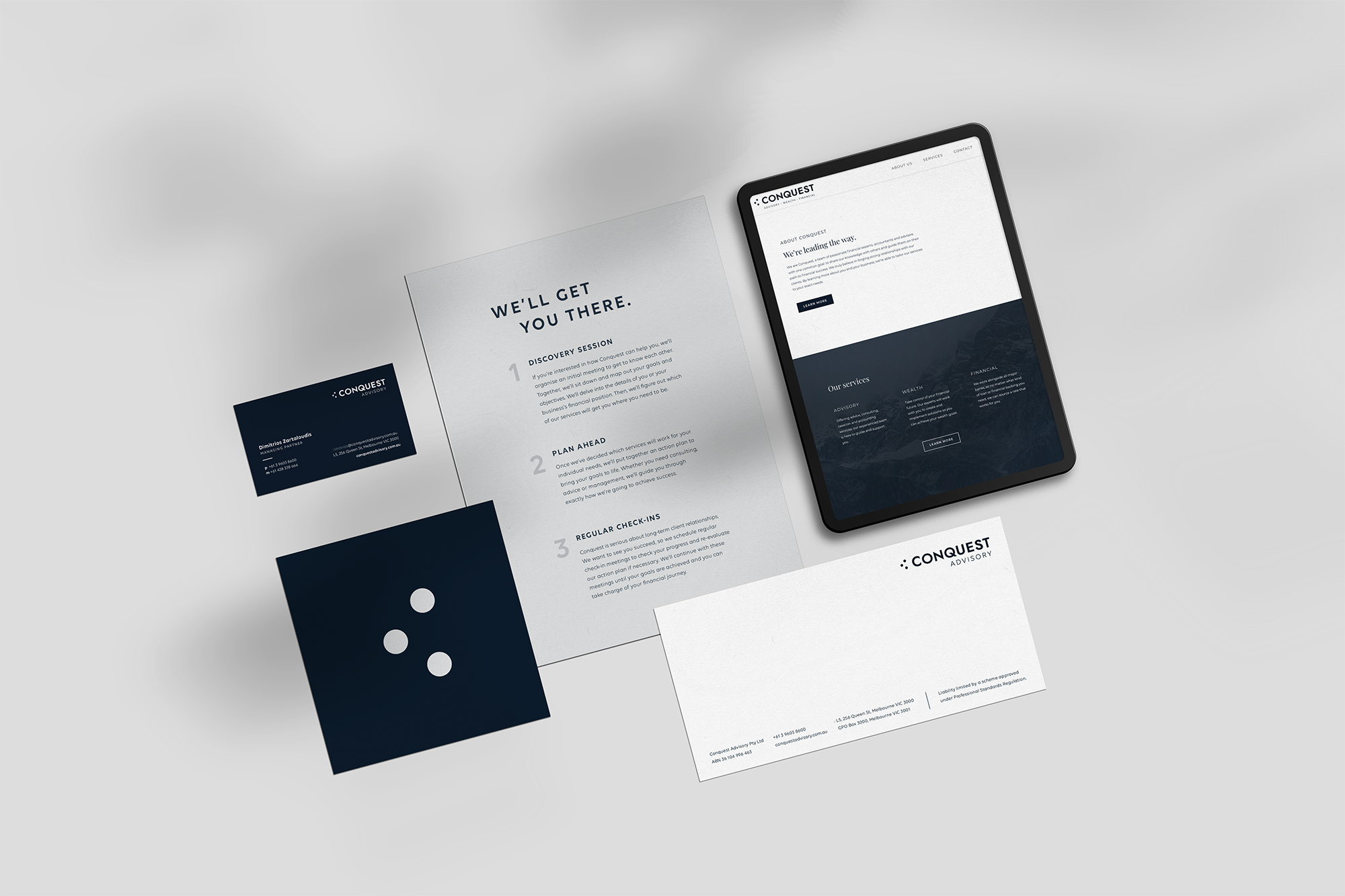
Juno love logos, so contact us if you are looking for a logo design Brisbane, Sydney or Melbourne. The purpose of a logo is not to describe your business literally, but to identify your business or product through the use of a mark or symbol. Your logo is an important component of your business or product’s visual identity.

It’s important to gain an understanding of your businesses purpose, objectives and target market so we can develop a logo that will set your business apart from its competitors and provide the foundation for your brand identity. We work with small business owners, through to large companies to create visually appealing logos that are simple, unique and memorable. View our portfolio.

BRANDING PORTFOLIO

BRAND IDENTITY

Your brand identity is key to establishing your brand as a whole and should be carried through everything you produce. Your logo is the symbol of your identity and brand, however your brand identity is about setting visual guidelines to ensure brand recognition and consistency. As with logo design, research is crucial to shape the direction of your brand identity.

We work with you to develop a brand identity to support your brand as a whole, to use across all mediums of visual communication such as stationery, marketing collateral, products and packaging, signage, website design and much more. View our portfolio.

GET IN TOUCH
logo design brisbane

FAQS

How important is colour selection in logo design?

A well designed logo should begin in black and white to ensure the logo is effective in its simplest form. When a logo has been selected, colour application is the next step and is a crucial element to designing an effective logo. Colour is subjective and if used appropriately it can influence the viewers perception of your business in a positive light and can add visual appeal to your brand. Your chosen colour palette should clearly communicate your objective to your target market and reflect the mood and personality you would like to convey. For example, blue is perceived to be clean and trustworthy, and offers a sense of assurance, suitable for branding a doctor’s surgery. Strong reds, oranges or yellows are intended to stimulate the viewer and ignite a sense of fun and excitement so they are well-suited to branding a gym or fast food outlet. The key to colour application is knowing your business, your target audience and selecting a colour palette that will capture the intended emotion.

Your logo should communicate clearly and concisely, who you are and what you do. Take the corporate identities of Nike and Apple for example – they each use a very simple icon that with or without text, is easily recognisable, striking and can be reproduced at any size. The more complex the logo, the harder it is to reproduce at smaller sizes and can lose detail. To design an effective, memorable and timeless logo that communicates your message successfully, simplicity is key.

Is a simple logo more effective?

Your logo should communicate clearly and concisely, who you are and what you do. Take the corporate identities of Nike and Apple for example – they each use a very simple icon that with or without text, is easily recognisable, striking and can be reproduced at any size. The more complex the logo, the harder it is to reproduce at smaller sizes and can lose detail. To design an effective, memorable and timeless logo that communicates your message successfully, simplicity is key. Juno are specialists if you need a logo design Brisbane, Sydney or Melbourne.

How important is typeface for logo design?

Typefaces can evoke different meanings to your audience and can work well used alone, providing the typeface you use for your business name reflects the mood you are trying to convey. For example, a florist may opt for a script or hand-written typeface to convey their message. Using only a symbol however, can lead to wider interpretation of what it is that your business does so to ensure your message is clear, your symbol could take on the name of your business, like Apple for example, whose infamous logo is an apple with a bite taken out of it. Using both a symbol and typeface can provide additional clarification and meaning than a typeface alone. For example, FedEx logo is very successful logo using both a typeface and symbol. The type incorporates an arrow pointing rightwards, nestled within the negative space created between the ‘E’ and ‘x’. This symbolises movement and direction which is perfectly suited to a freight company.

What file formats will my logo be supplied in?

Typically, your logo will be designed in a vector format (.eps and .ai) to ensure that it is scalable and can be reproduced at any size without losing quality. Using a vector format is also important if you need colours to be printed accurately, as vector logos can be printed using the Pantone Matching System (or PMS). Vector logos can also be printed in black and white and four colour process (CMYK). Depending on the application, you may also require your logo in a pixel or ‘raster’ format (.jpg .gif .tif .bmp and .png). Raster images are made up of several tiny pixels that together form a larger image. They are also resolution dependent, meaning that if you stretch or enlarge the image, it could pixelate, compromising the overall quality of the image, so it is important to consider how you will be using the logo. Speak to us in further detail so we can supply your logo in the best format for your requirements.

Juno are specialists in branding so contact us if you are looking for a logo design Brisbane, Sydney or Melbourne

We’re only a phone call away!

Give us a buzz on (07) 3257 1115.
To see more of our design work, check out our portfolio and follow our work on instagram.