Objective
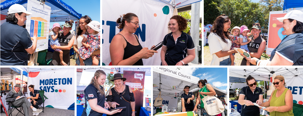
Located between Brisbane and Sunshine Coast, Moreton Bay Regional Council (MBRC) governs one of the fastest developing places in Australia. With the unprecedented growth and development in the area, MBRC has developed an engagement program called “Moreton Says” as a way to connect more strongly with the surrounding communities and to better understand what’s important to them from the people when it comes to future planning and decision making.
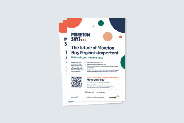
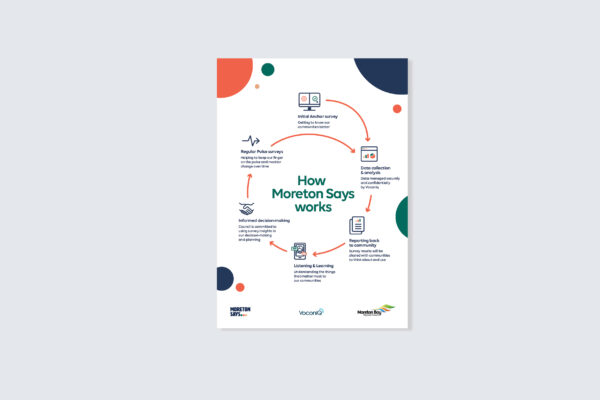
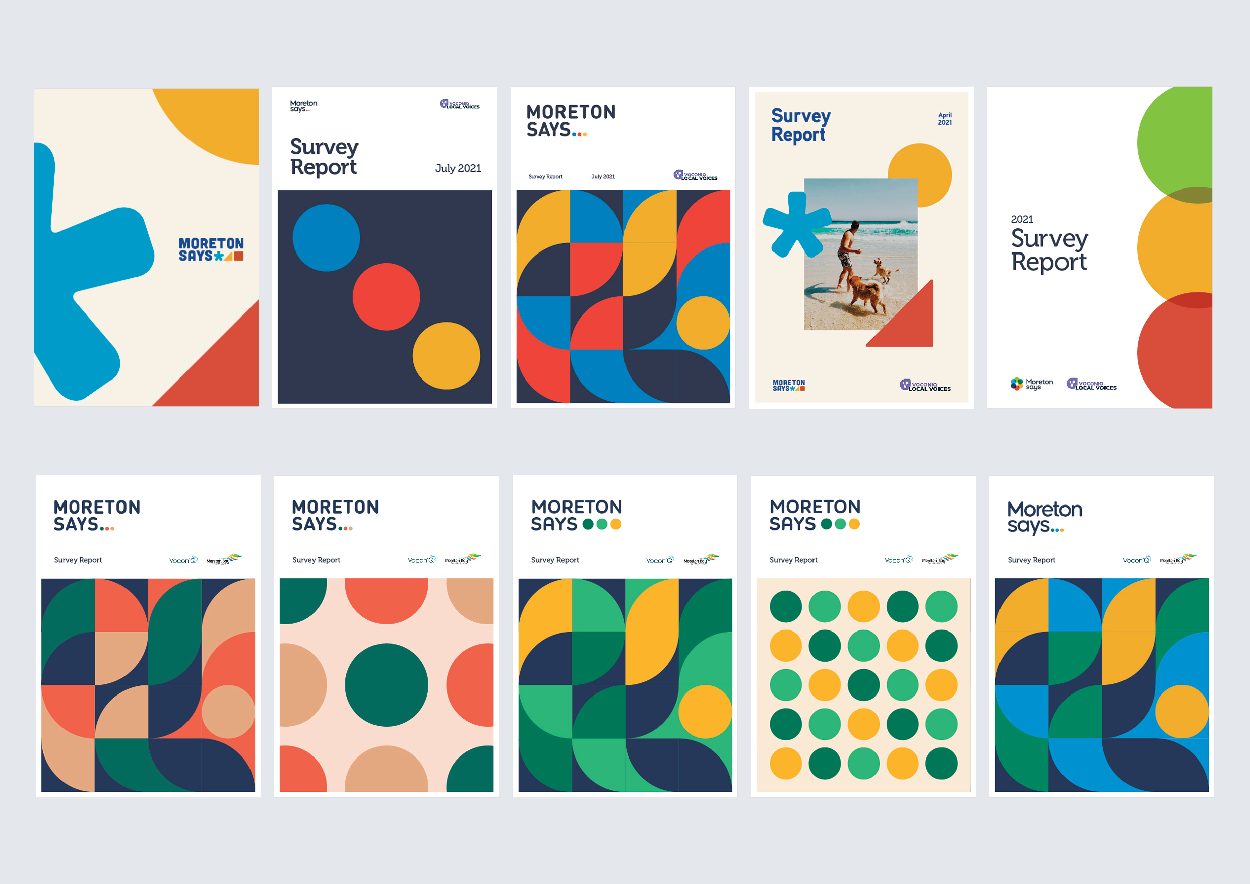
MBRC tasked Juno to develop a new look and feel for Moreton Says, and roll out brand collateral as part of their campaign.
The Process
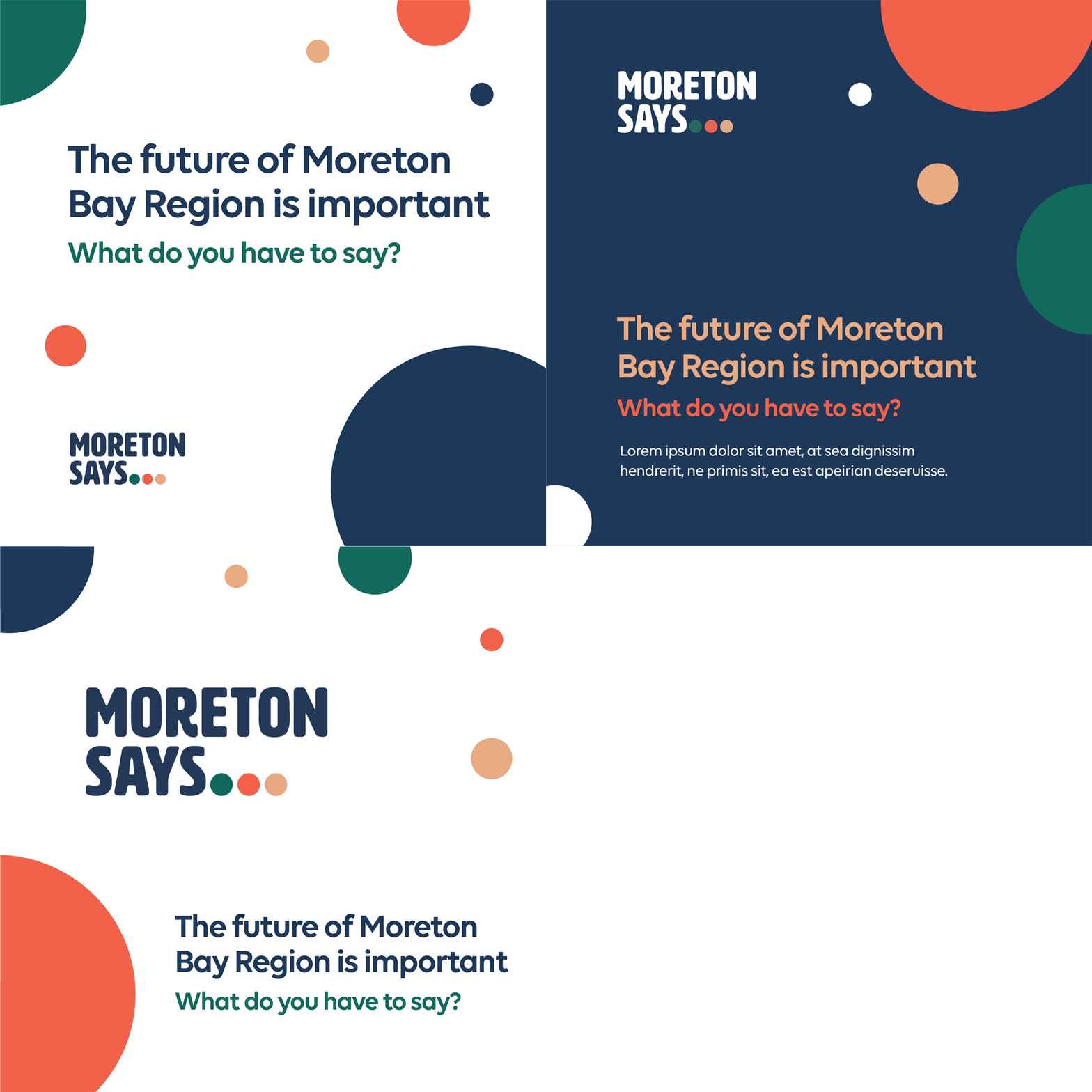
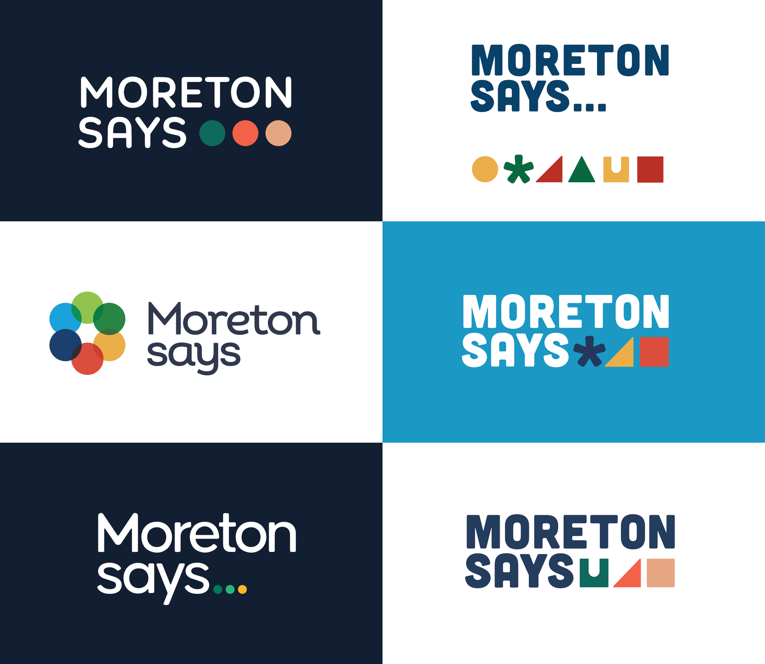
The client wanted their own identity for Moreton Says while still associating with the MBRC brand. Contemporary and clean, fresh and friendly, genuine, future-focused and recognisable were what was envisaged for their logo. During the moodboarding process, we felt that the best way to bring their vision to life was to incorporate graphical elements and colours to represent their different pillars of the organisation, as well as building connection and likability so that the future people of Moreton would be encouraged to be involved with Moreton Says initiative.
Working closely with the client and taking on board their feedback, we explored different graphical elements and colour pairings. After much feedback, we eventually nailed the new logo of Moreton Says that spoke to the future of the Moreton Bay region. Introducing a modern and clean typeface, paired with corporate navy inherent to MBRC’s own branding (to main association with the Council), this new identity takes on a more playful, welcoming and versatile design that would suit various applications. Muted colour palettes of coral, pine and dune serve as the secondary colours to the new look and feel.
