The Project
Off the back of a very successful event in 2019, Safer Care Victoria approached Juno looking for a refreshed branding identity for their Giant Steps 2021 event.
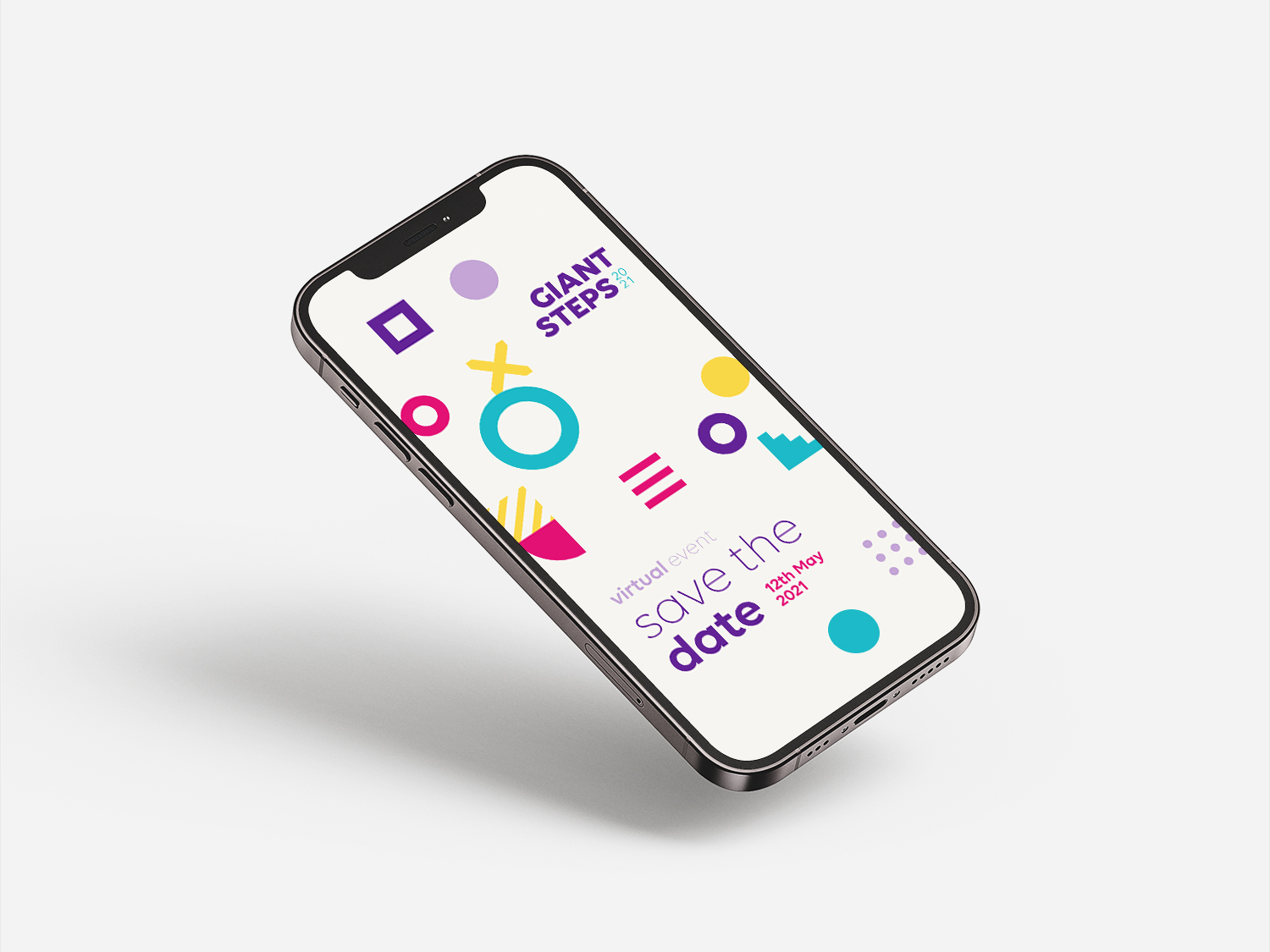
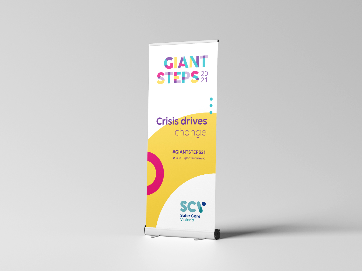
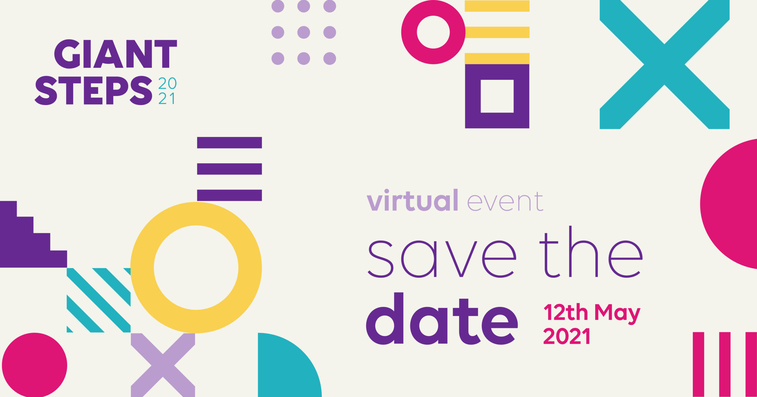
Keeping the geometric shapes used in previous years to help maintain the Giant Steps connection, our redesign consisted of adding new modular graphical elements and incorporating lines and dots throughout to give the look and feel a fresh and playful spin. These additions have allowed us to apply them across stationary, printed documents, banners and digital content without feeling overused yet still consistent throughout the entire marketing collateral.
The combined geometric shapes symbolise the pooling of skills and interests of the conference attendees, while illustrating the concept of collaboration and support. The colour scheme have also been updated with bright, bold and playful tones of pink, blue, yellow and purple to add interest to the design and reflecting on the diversity of the participants.
CONTACT US


IMAGINATION FOR SALE
LETS CHAT
Kind Words: Monique Currin
“I’ve been working with Juno Creative for the last few years and cannot recommend them highly enough. My request to ‘work outside the box’ was all it took for them to create the most amazing look and feel for our events. Attendees at these events regularly made comments about the printed collateral and the atmosphere it created! They’ve set a very high bench-mark!”
