The Project
HealthX came to Juno seeking a brand overhaul to help better represent their ever-expanding business. As a healthcare-oriented business that works alongside nurses and hospitals, it was important for the new branding to instil a sense of trust, credibility and experience, while still keeping it fresh and modern.
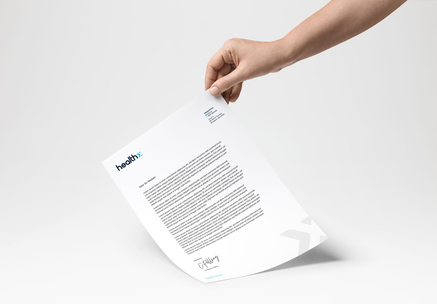
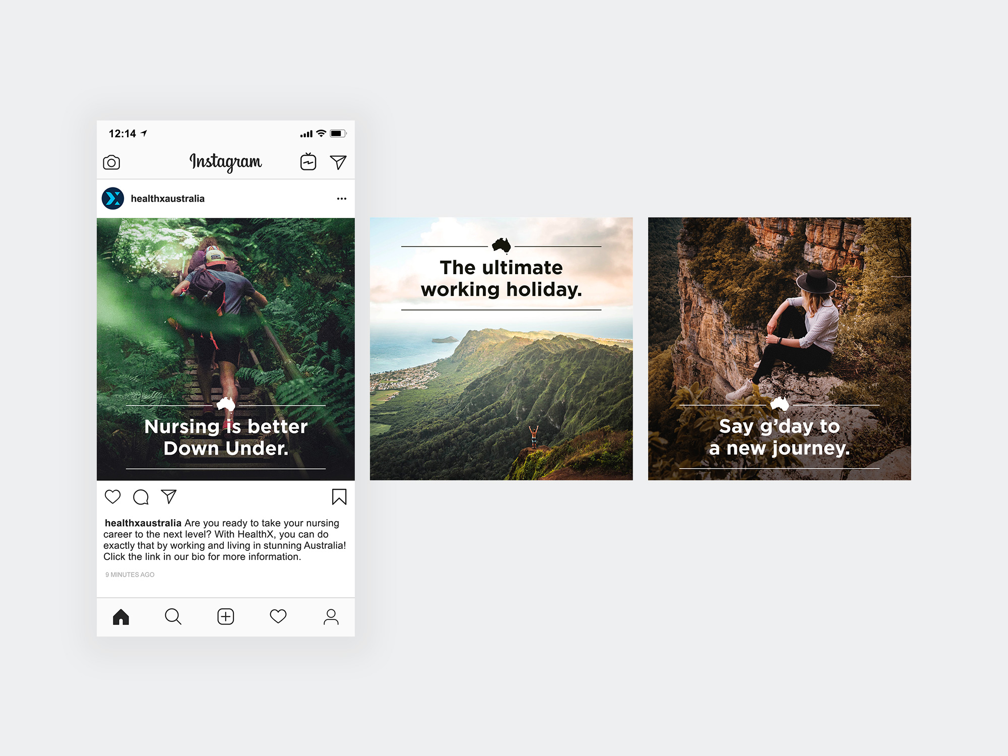
We decided to tell the brand story through the logo by utilising the ‘X’ in the name. As HealthX is constantly growing and evolving in the healthcare industry, we felt it was fitting to design the ‘X’ to represent an arrow shape, pointing forwards. A new navy and blue colour scheme was chosen to revitalise the brand identity from the original orange and charcoal. These colours are versatile, refined and feel modern, but have the longevity to stay relevant for years to come. The hints of lighter blue pay homage to the healthcare field without feeling overly typical of the industry.
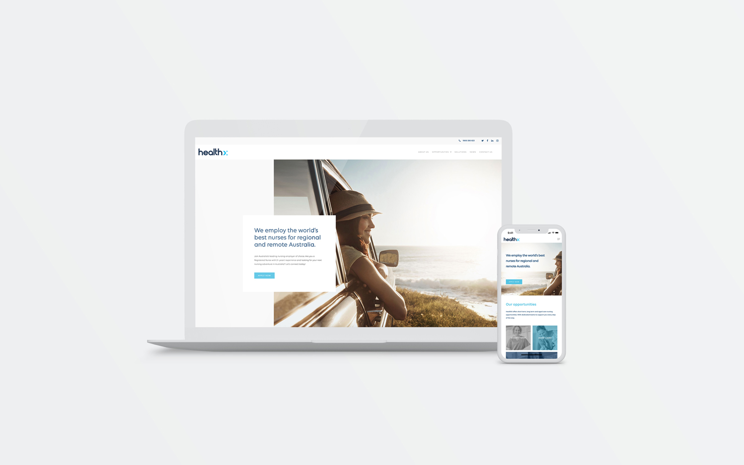
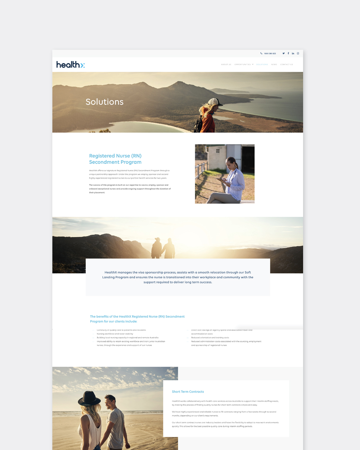
View their Juno made website here.
CONTACT US


