![]()
Balter. Adj.
To dance artlessly, usually without practiced form or skill,
but always with great, contented enjoyment.
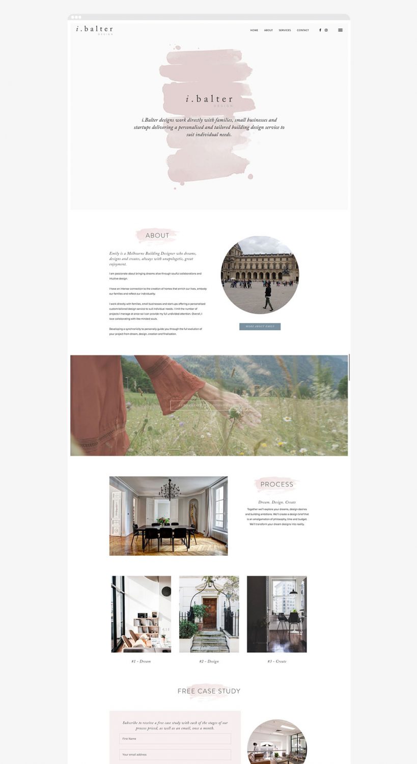
i.Balter design works directly with families, small businesses and startups, delivering a personalised and tailored building design service to suit individual needs. They primarily engage with clients who they feel are the right fit based on their philosophy and creative approach. With a strong focus on process and enjoyment, i.balter really believe in being unapologetically true to yourself, and work with like-minded people, so this formed the brief and direction for the project.
The process
From initial concept through to the final outcome, we worked closely with Emily to refine and explore variations, to make sure the end result is reflective of her business and personality.
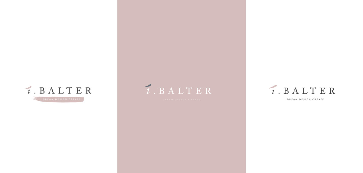
Refinements were then made to make the logo feel softer by exploring lower case variations and softer graphic elements.
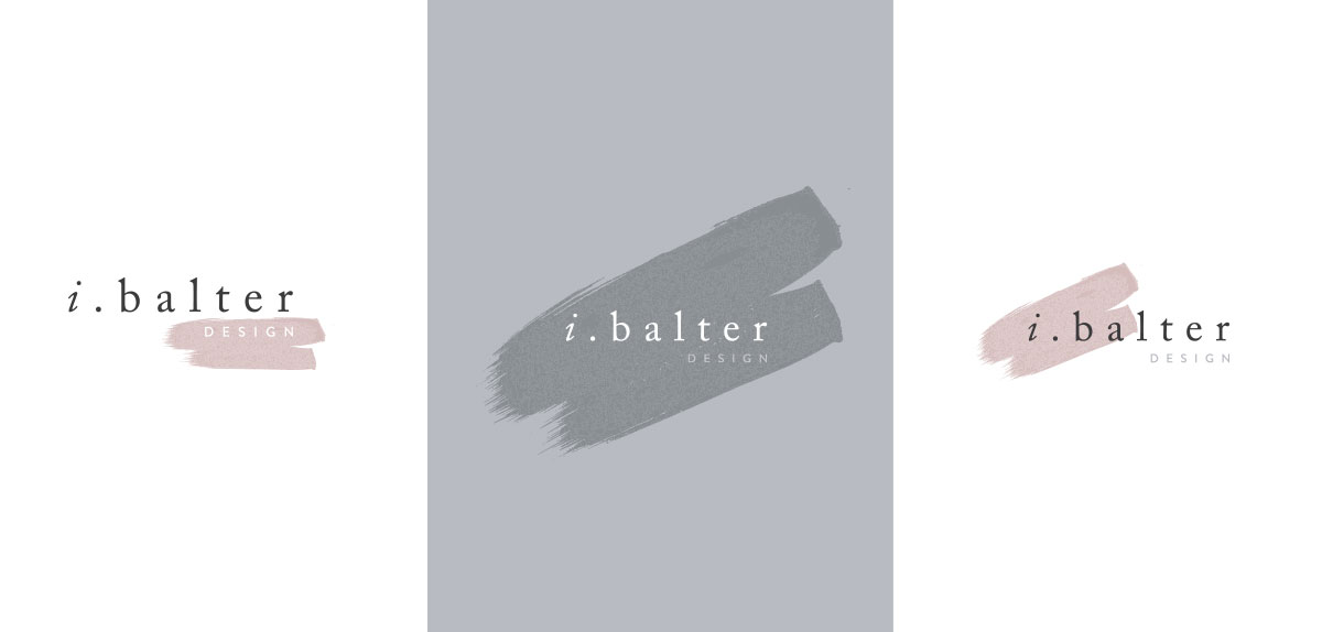
After exploring the watercolour element within the logo itself, the team decided to keep the logo clean and simple, and use the graphic element as a hook throughout the rest of the brand, as shown further down this post.
The outcome
![]()
The brand logo uses a classic serif typeface paired with a contemporary sans-serif, and soft colour palette, creating a sense of luxury, femininity and simplicity.
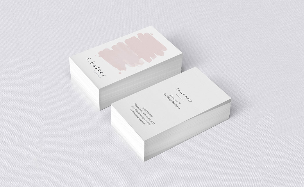
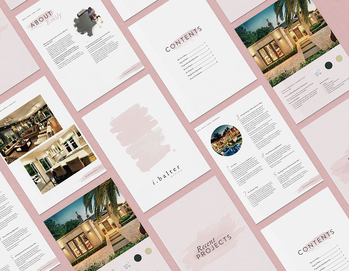
Collateral
The organic feel of the blush watercolour element is symbolic of freedom and movement, derived from the philosophy behind ‘Balter’.
To visit the website, head on over to www.ibalterdesign.com.au
Finally showing a branding project to the world is always exciting and inspires us to get started on our next design project. If you’ve been thinking about giving your brand a facelift, give us a call today!