The Project
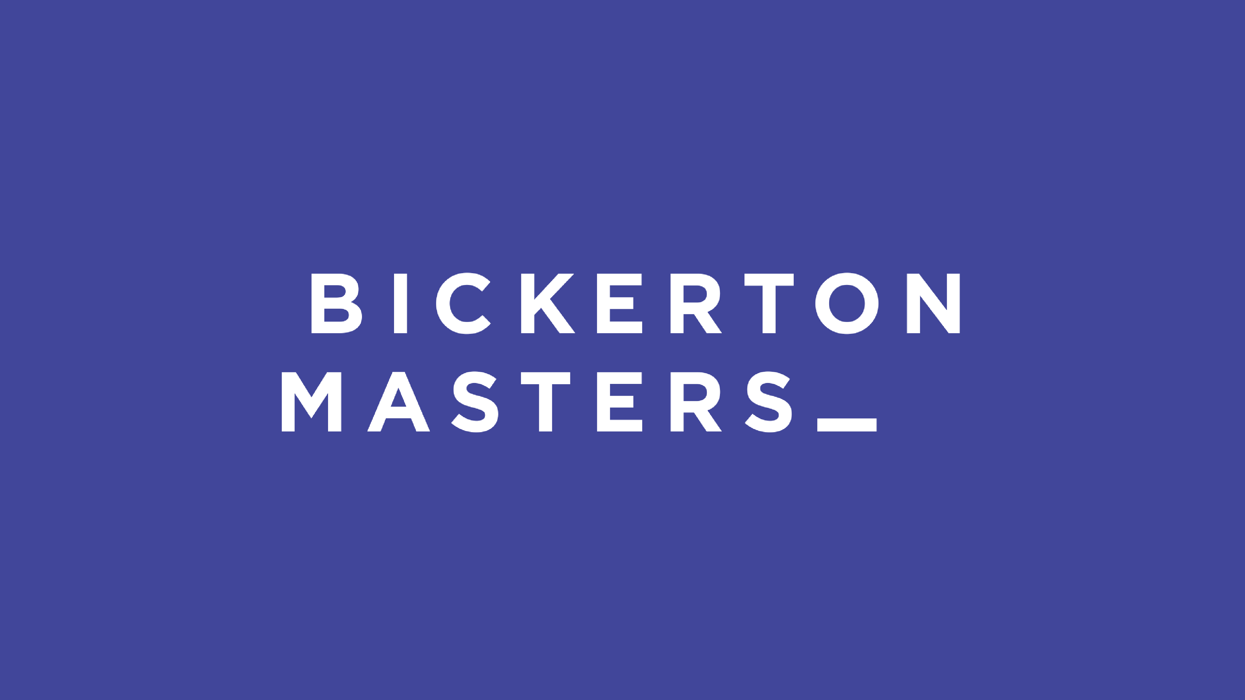
Bickerton Masters (BM) are architects who don’t want to look like architects – they want to be bold, fresh and stand out from the crowd. The identity that the Juno team developed breaks away from the norm for architecture firms – into something fresh, unique and totally unexpected.
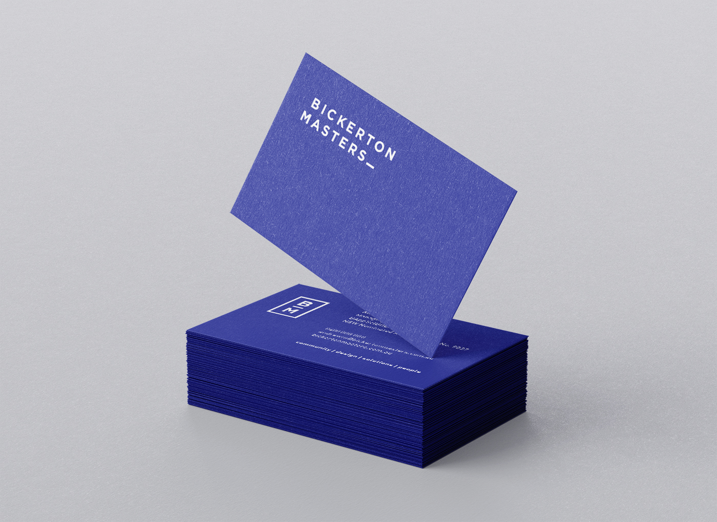
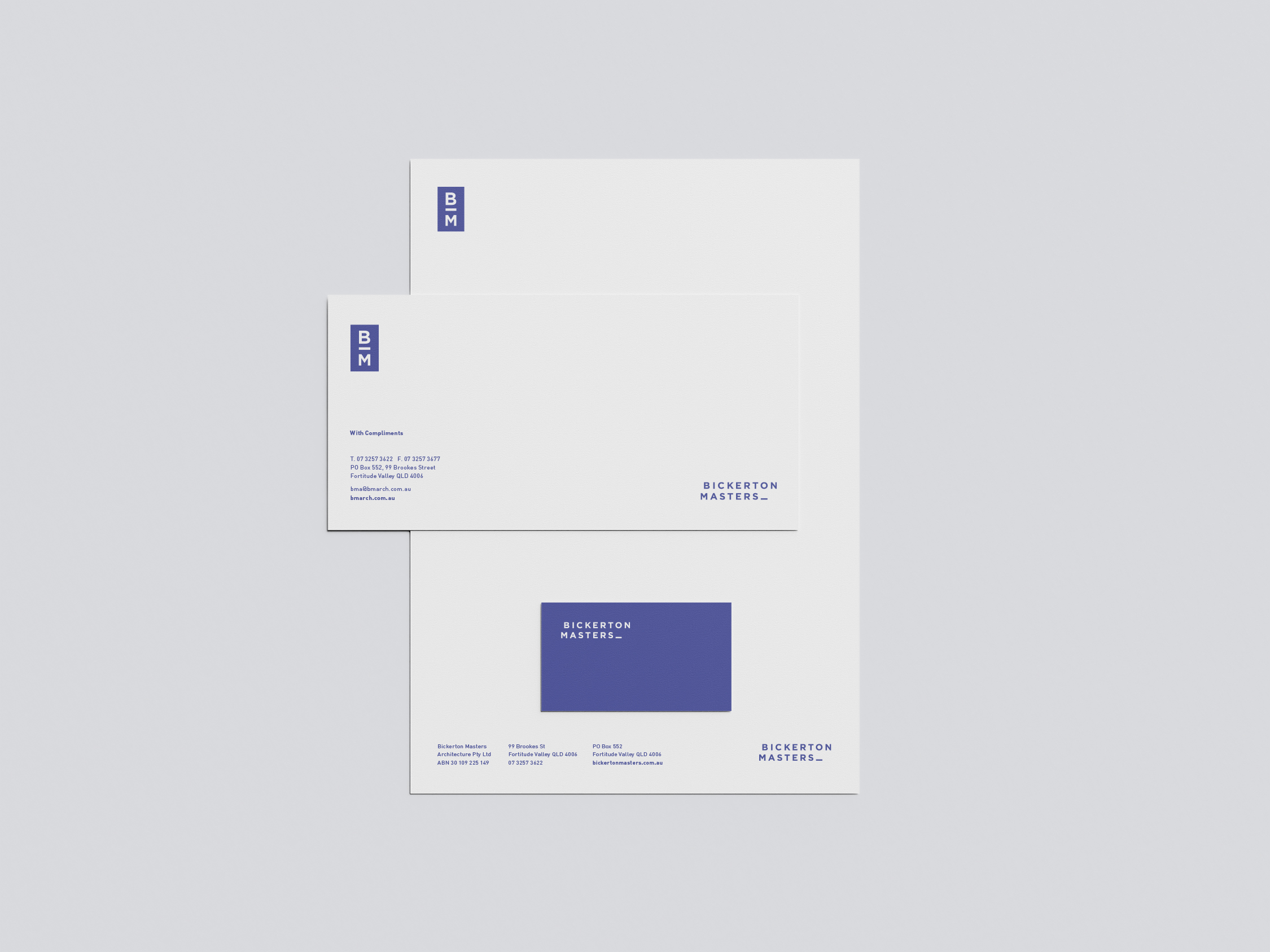
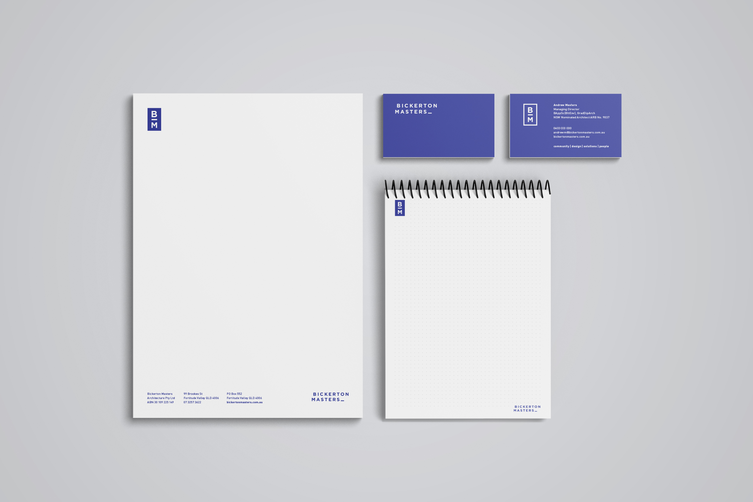
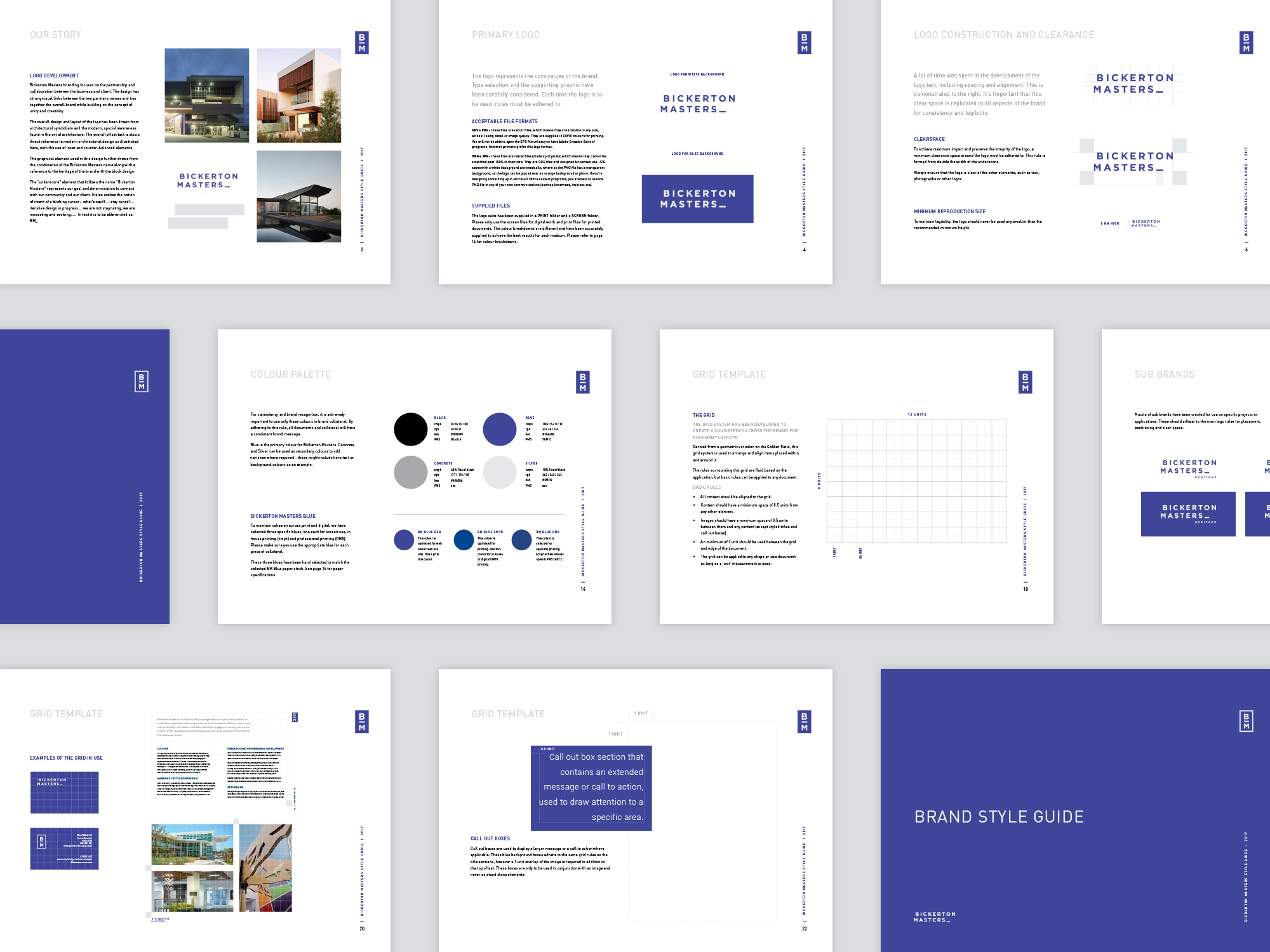
Opting for a strong sans serif typeface, the logo is impactful yet still speaks to the spacial awareness in the art of architecture. The underscore element represents the BM goal and their determination to connect with both the community and the client. It also evokes the notion of intent of a blinking cursor – showing that the business is always growing, adapting and adding new chapters to their story. The website features dynamic elements, pops of indigo and thoughtful white space, ensuring it’s not only consistent with other branded touch-points, but also user friendly. It is in the stationery suite where the use of considered space shines.
View their Juno made website here.
CONTACT US


