Website Design Brisbane | Website Design Melbourne | Responsive Web Design
Is something that looks beautiful better quality? People seem to think so. There’s been an observed effect called the ‘beauty bias’ that dramatically causes us to place more trust in attractiveness, and web design is not exempt. The look of your website can make or break its success: if it’s beautiful, it reflects extremely positively on your brand; if it’s not, then people may just close the window and pursue your competitor’s more beautiful website instead. But is a website’s form the deciding factor in its success?
It’s true that the form of your website is extremely important:
personal and positive relationships with a design evoke feelings of affection, loyalty, and patience — all significant factors in the long-term usability and overall success of a design. (Chakraborty, A, 2017)
But web design, unlike fine arts, is so inextricably bound to its function that no amount of decoration can save a website that simply doesn’t work. Let’s have a look at some common functionality mistakes that can detract from the overall website experience.
It has good form, but it has an annoying menu
You want to direct people around your website smoothly, especially if you offer a multitude of products or services, but people will give up if it’s too hard to find the page they want or to simply click on a drop down menu link without the whole menu disappearing or changing. Another common issue is not having a sticky header – a menu that stays on the top of the screen while you scroll – it’s annoying to have to scroll all the way back to the top of a long page.
The takeaway: if you don’t make it easy for people to navigate your site, they will go elsewhere.
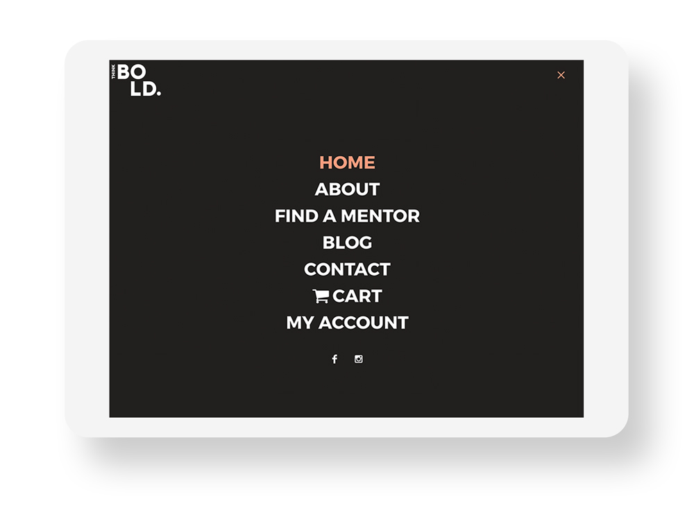
A good example of functional, simple navigation is one of our clients: Think Bold
It has good form, but it’s not mobile responsive
People might still use the website, but if they keep having to pinch and shift their screens constantly just to read your content, they’re less likely to stay on the site for long, or click through to as many pages. And if you’re blogging or directing ads to your website, the vast majority of visitors will come via their phones, so you’re literally wasting money if your website doesn’t work well on mobile. Read more about mobile responsiveness and what it means for your business here.
The takeaway: if it looks great on desktop but doesn’t function well on mobile, you’re missing out on immeasurable opportunities.
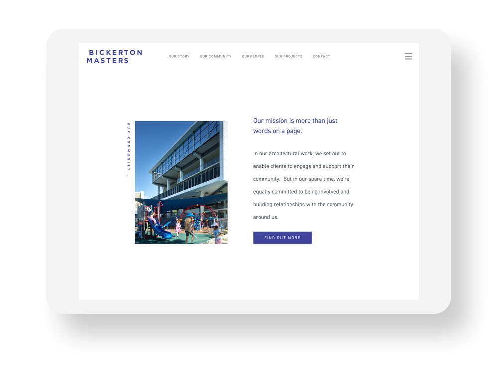
A good example of Responsiveness: Bickerton Masters
It has good form, but it’s too slow
People online are impatient, so if your website is taking more than a few seconds to load, you’re losing countless potential customers. While your site may look beautiful with full screen, high-res imagery, if you haven’t optimised those images for the web people aren’t going to wait around to see your masterpiece. Same goes for feature upon feature or having too much content: keep it simple and stick to the core functionality you need.
The takeaway: if your website takes too long to get to the point, people aren’t going to stick around.
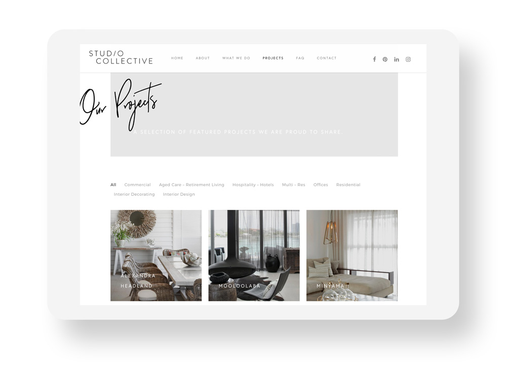
A good example of Image Optimisation: Studio Collective
It has good form, but it’s not clear what it’s selling
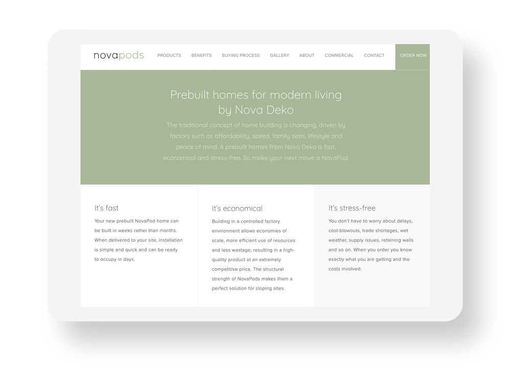
Function doesn’t just relate to technological functionality – the function of your website is first and foremost to sell your brand. A great website is made up of engaging content, emotive imagery, and a hierarchical structure – if it looks beautiful but lacks substance your audience won’t be able to connect with your brand. So if your copy doesn’t clearly explore what you’re all about, your imagery is out of touch or non-existent, or your descriptive copy is hidden away beneath less important elements, you’re not likely to retain any long-term interest.
The takeaway: if your website looks good but doesn’t engage on a personal level with your audience, they’re not going to connect with your brand.
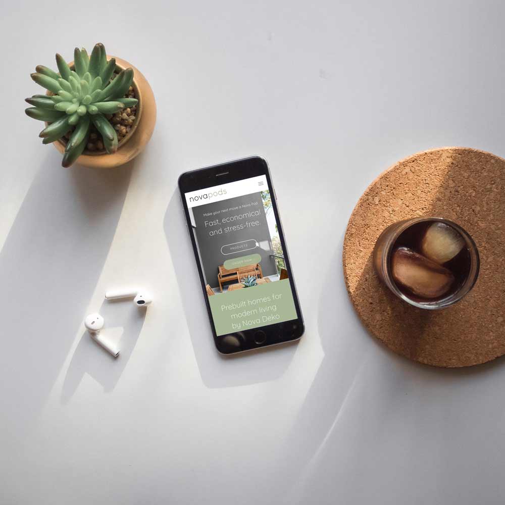
A good example of Website Content: Nova Pods
See the rest of our project for Think bold here.
The Most Successful Websites are those that Balance Aesthetics with Functionality
Overall, the importance of having a great looking website cannot be overstated, but the beauty bias only covers up so much – if the function of your website is lacking, people’s patience will run out. But if you work with website designers, like Juno, who understand the balance between user experience and aesthetics, you’ll get a website that works for you, not against you.
