Objective
Dental Protection is a leading protection organisation for doctors, dentists and healthcare professionals globally. Dental Protection approached Juno to create an integrated marketing campaign that raised awareness about their premium costs compared to their compared competitors including MIPS, QBE and Experien, and encourage indemnity insurance sign ups and renewals to current and prospective customers for the new financial year.
Dental Protection tasked us to conduct research on their business, their competitors and the current market to deliver a campaign concept that cut-through with their audiences across print and social media.

The Process
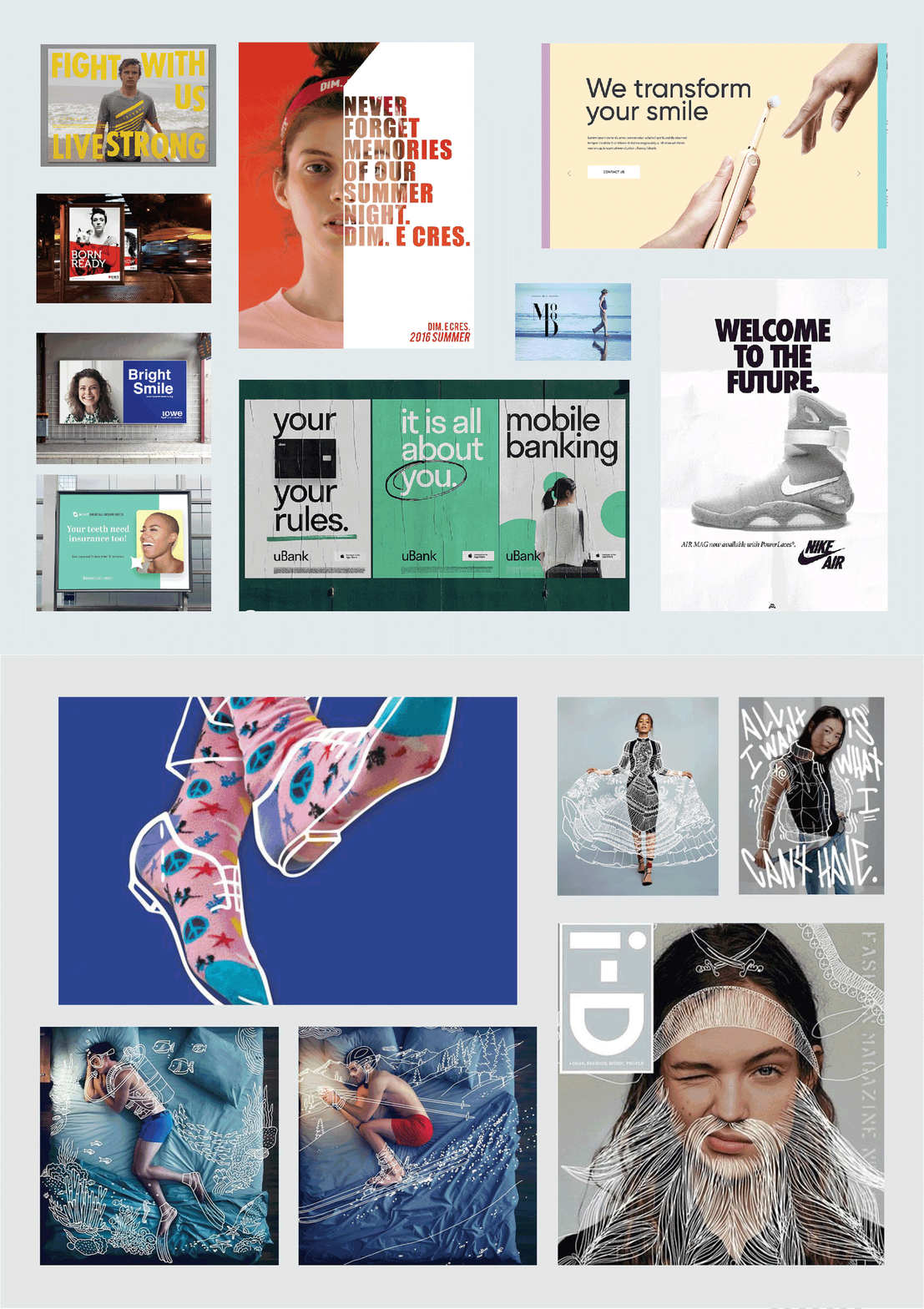
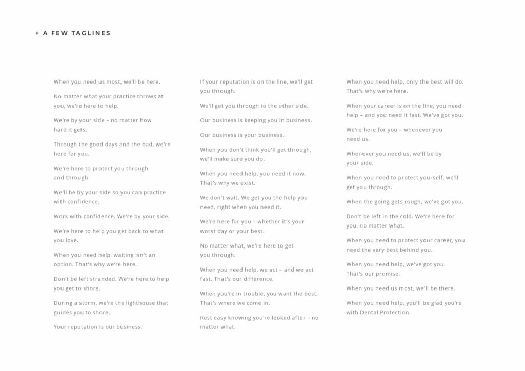
During the workshopping process, Juno mood-boarded multiple concepts and provided Dental Protection with two contrasting design directions for the campaign. Concept 1 incorporated bold fonts and equally strong typefaces, which would be paired with light-hearted photography that showed relaxed individuals to represent a sense of security and assurance. Comparatively, Concept 2 inherited a more playful approach and involved an images of dentists, overlaid with loose doodle-like drawing to signify security, safety and support from Dental Protection. To help bring the concepts to life, Juno also produced and supplied a range of short yet engaging taglines for Dental Protection that would support the artwork and help convey their message.
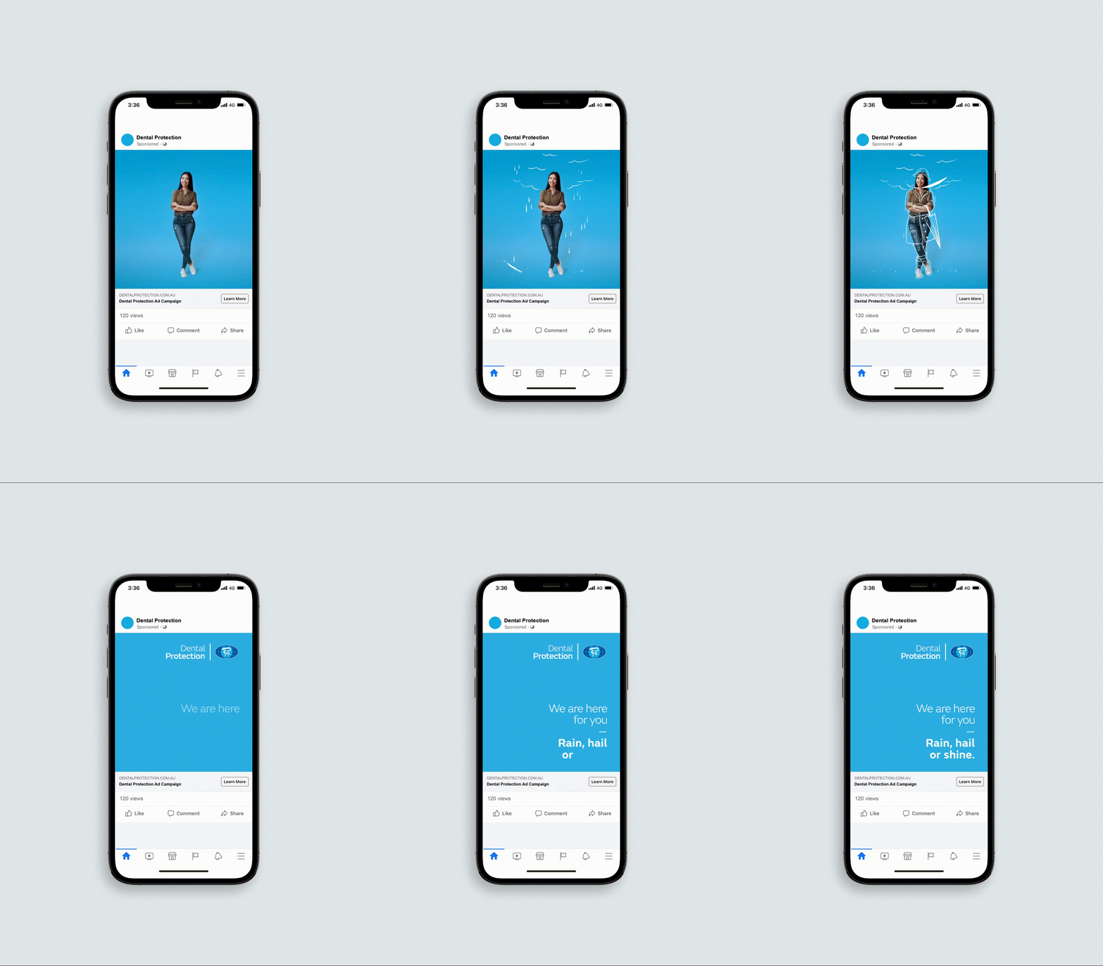
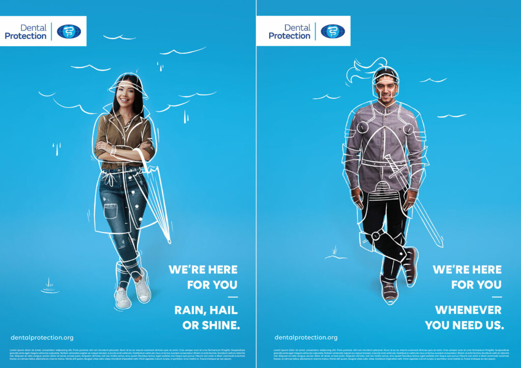
After scoping both concepts with the client, Juno was given approval for Concept 2 which meant one thing – the fun part of bringing the campaign to life was about to start. When it came to the design process, Juno conceptualised three designs – Astronaut, Knight and Rain that would form the basis of the campaign. We also refined the taglines for each scenario in order to convey a strong message and evoke feelings of security and protection offered by Dental Protection.
Throughout the entire process, Juno communicated with Dental Protection with any updates and worked collaboratively with their feedback to ensure their campaign vision was captured while balancing design principles. We made sure that the styling of the copy and logo reflected their style guidelines to ensure consistency with their brand.


