The Project
Ansvar strives to be the most trusted and ethical specialist insurer within their core sectors, and to contribute to and help build safer communities that promote well-being and peace of mind. However, over the years, Ansvar lost its way from a brand identity perspective with changes in brand strategy resulting in an ambiguous brand identity and a visually old and tired looking brand.
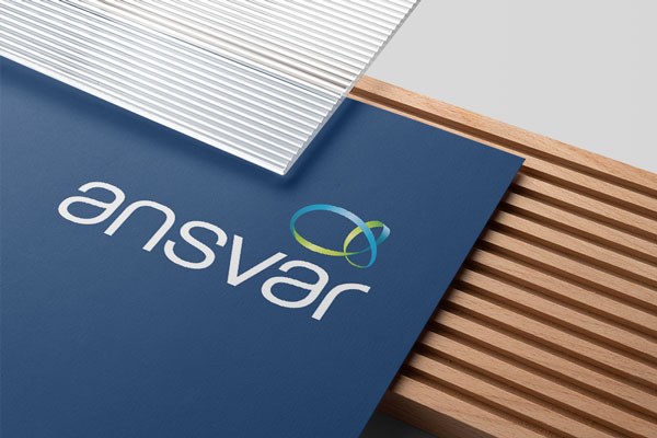
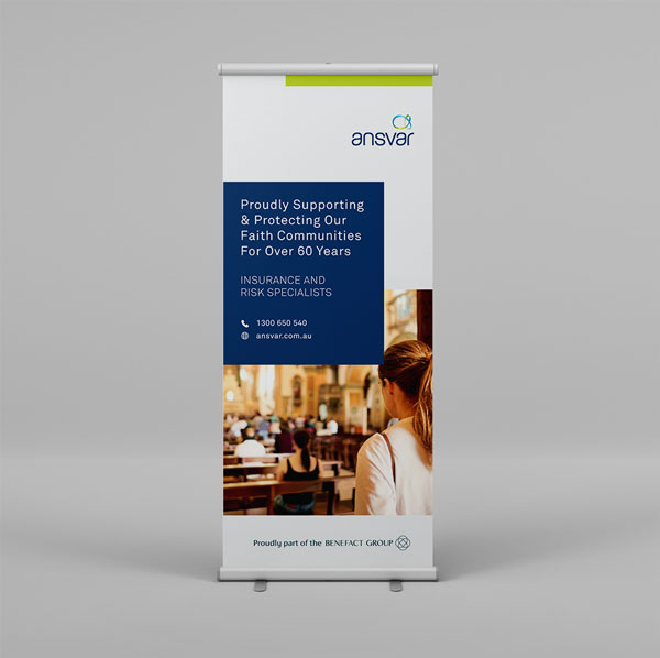
As the brand was already highly recognisable, we did not want to alter the logo too drastically as to avoid confusing. Therefore, we elevated the original logo by simplifying the gradient symbol and adjusting the logo spacing. Alongside logo updates, we created several print collateral elements for in house use, events and campaigns.


