Choosing the right colour palette for your brand or design project is just as important as the actual design. Here at Juno, we love exploring colour and the emotions they can evoke, so here are three quick tips when selecting select a colour palette for your project…
TIP #1
Research, research, research! An understanding of colour theory will help you to avoid a potential colour disaster! We spotted this article via dtelepathy.com which covers the basics of colour theory, the difference between analogous and complimentary colour palettes and how trends can influence your design.

An example of an analogous colour palette {image via dtelepathy.com}
TIP #2
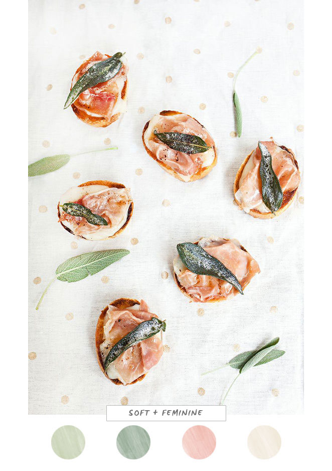
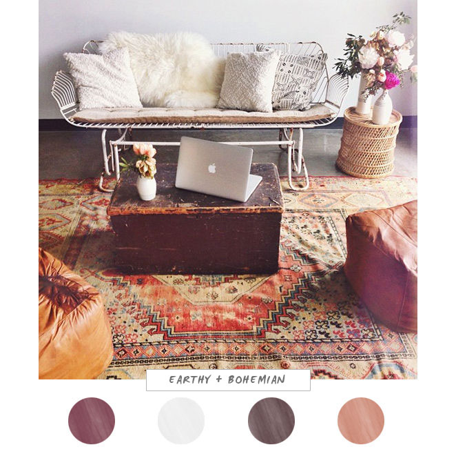
One of our favourite ways to choose a colour palette is to browse our favourite websites or Pinterest (side note: if you don’t have a pinterest account, get one. It will change your life) and pay particular attention to images that inspire us or draw us in. Here are a couple of colour palettes we’ve created using images we found via designlovefest.com as inspiration:
TIP #3
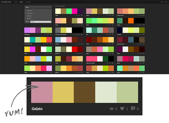
Adobe Kuler is a fantastic resource that let’s you explore colour themes uploaded by users from all around the world. You can search by most popular, most used, or enter your own search terms if you’re after a certain feel. For the example below, we did a search on ‘gelato’ which gave us some tasty interesting combinations.
Well there you have it folks! We’d love to hear your thoughts or suggestions in the comments section below.


