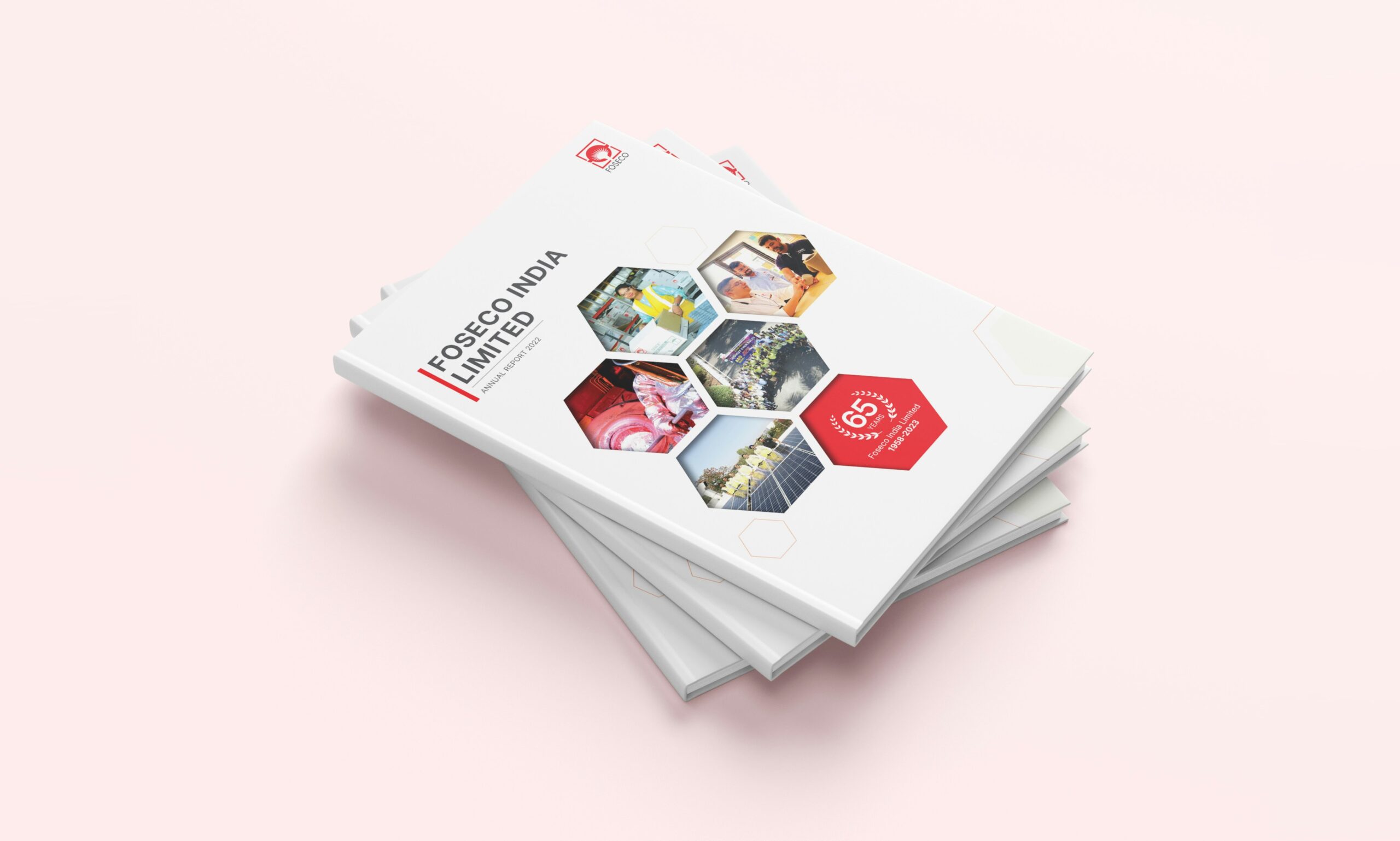
Annual Report Design Melbourne

ANNUAL REPORT DESIGN MELBOURNE

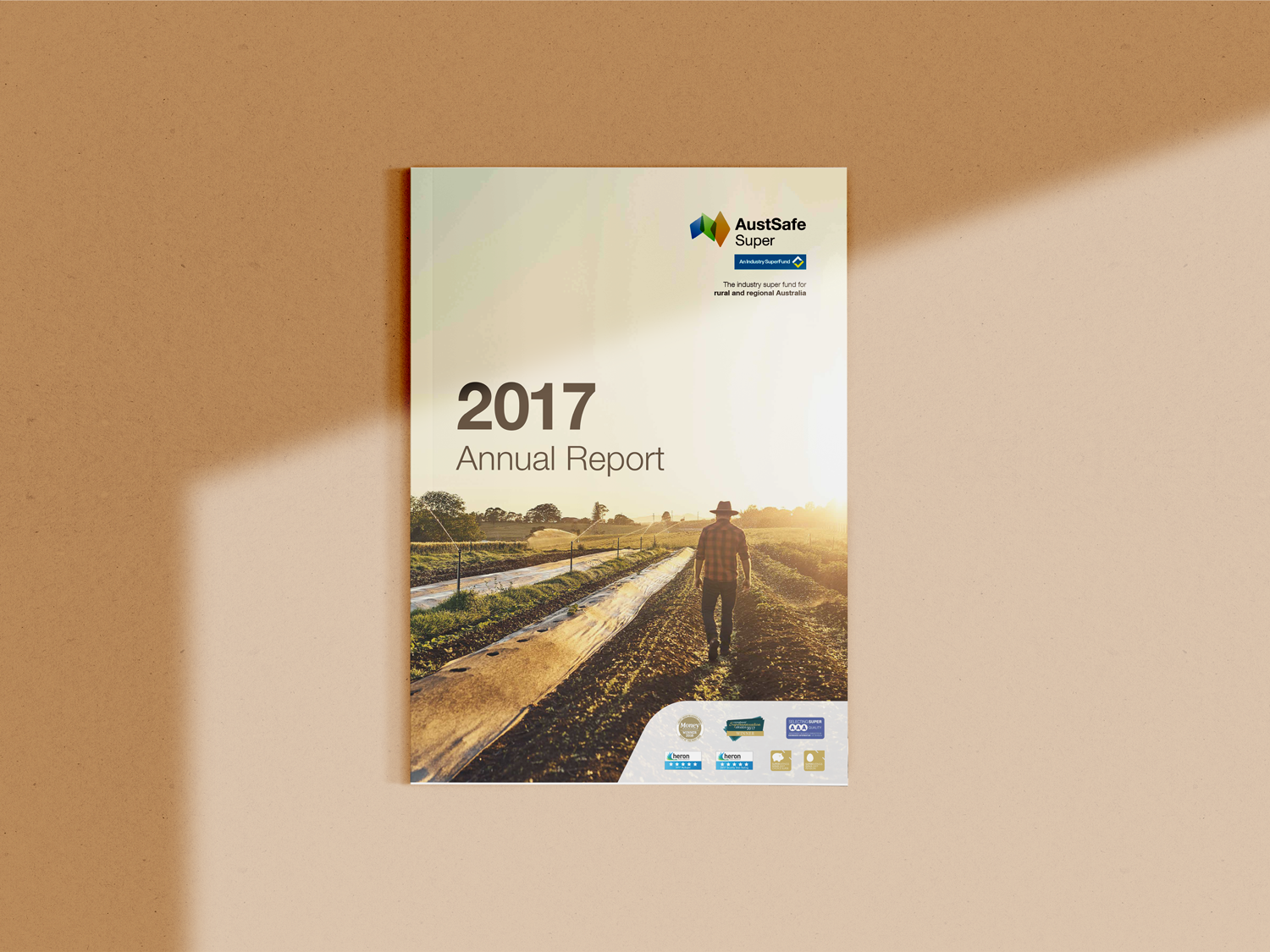
Gone are the days where an Annual Report design is a boring, 80-something-page, text- heavy document. An Annual Report is an extension of your brand, so it needs to be treated like any other marketing tool in your business. Collaborating with your designer right from the very outset, ensures you’ll end up with an Annual Report that is not only on-brand, but well designed and thought out impressing your stakeholders (and potential ones!). So with that said, we thought we’d share our tips…

Content is Key

Gathering, planning and creating content for your Annual Report can be a time consuming (yet oh-so-important) process. Start early, so when it comes time to contract a designer, they can work their magic! Don’t forget to consider imagery too, as this is just as crucial in conveying your message.

Proof read your content before you send it to your designer. This will drastically cut back on design time, saving you money, keeping your project’s timeline in check and your designer happy! Most design studios will offer a set number of changes included in their quote, so supplying final (or as close to as possible) content is something you can control right from the get go. Proof reading also ensures your company’s voice is consistent throughout the report, especially if multiple people are writing content for different sections. Your tone of voice is just as important as the content itself, in order for readers to feel they are a part of your brand’s vision. Lastly, make sure your content is cohesive. No one wants to read a long-winded, text heavy document that doesn’t flow (yawn!). A well structured Annual Report will keep your audience interested and on board!

Design to engage – this is where we step in!

We like to begin with a clear brief on your company and your brand; what is your vision and purpose, what are your main messages, what do you like / don’t like (visual examples are always beneficial). It is also very helpful to provide us with all your existing brand elements, so we can ensure your Annual Report design is consistent with your other marketing materials. Our job is to convey your content and key messages in a clear, professional and creative manner. Creativity is what will make your Annual Report stand out; this doesn’t necessarily mean bright colours and crazy fonts, it means using your existing brand elements to produce an interesting and visually engaging Annual Report that is relevant to your brand and industry.

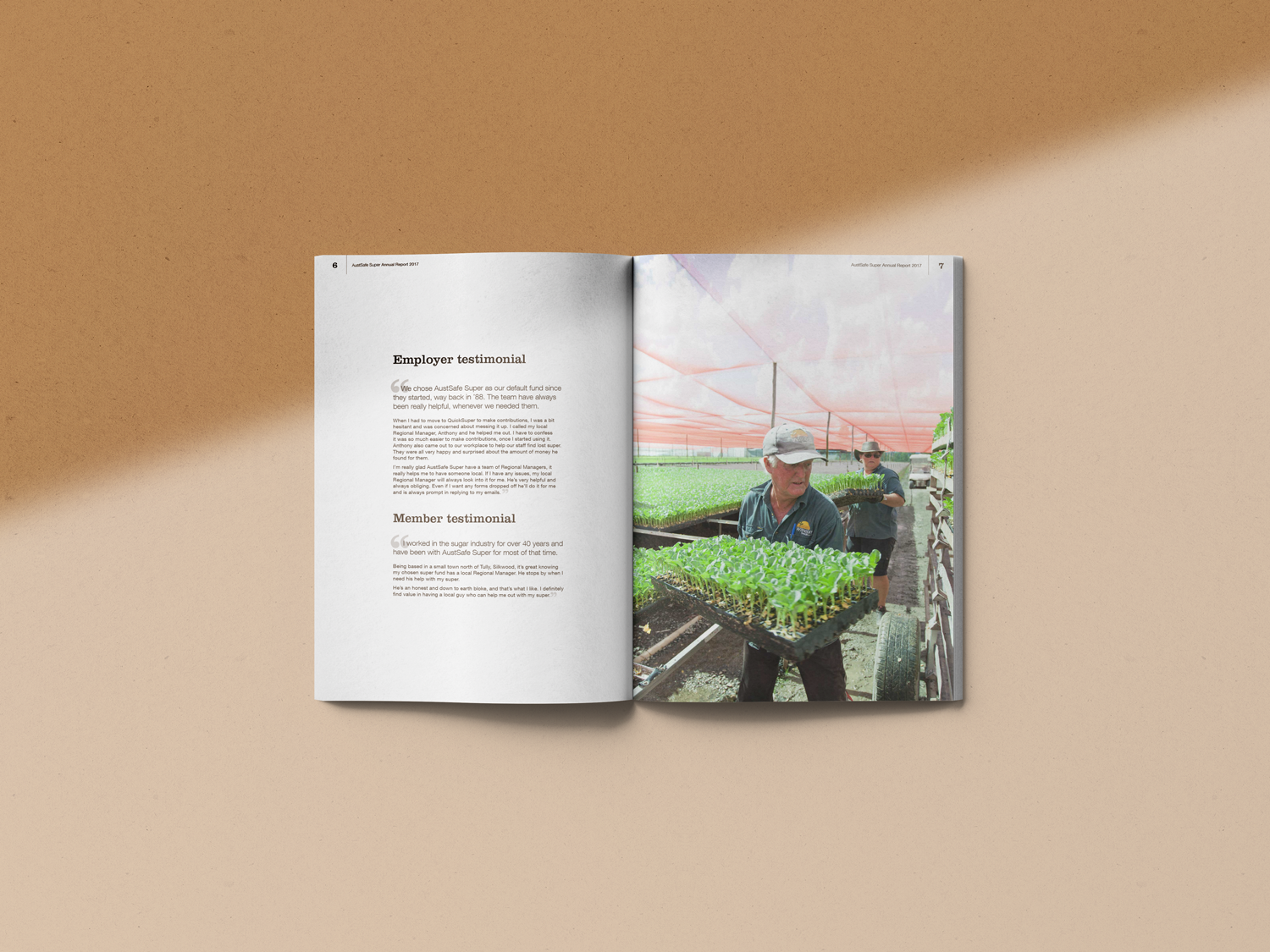
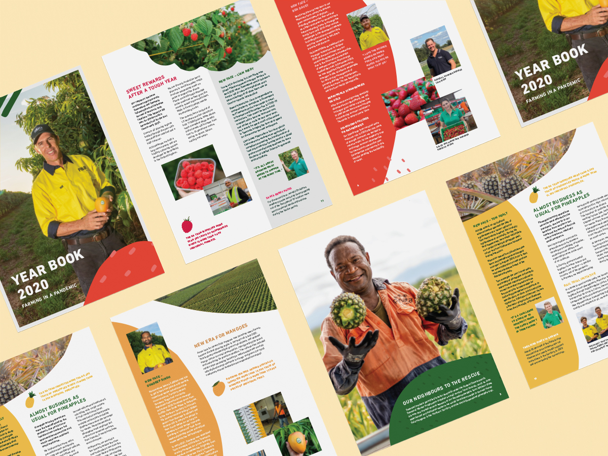
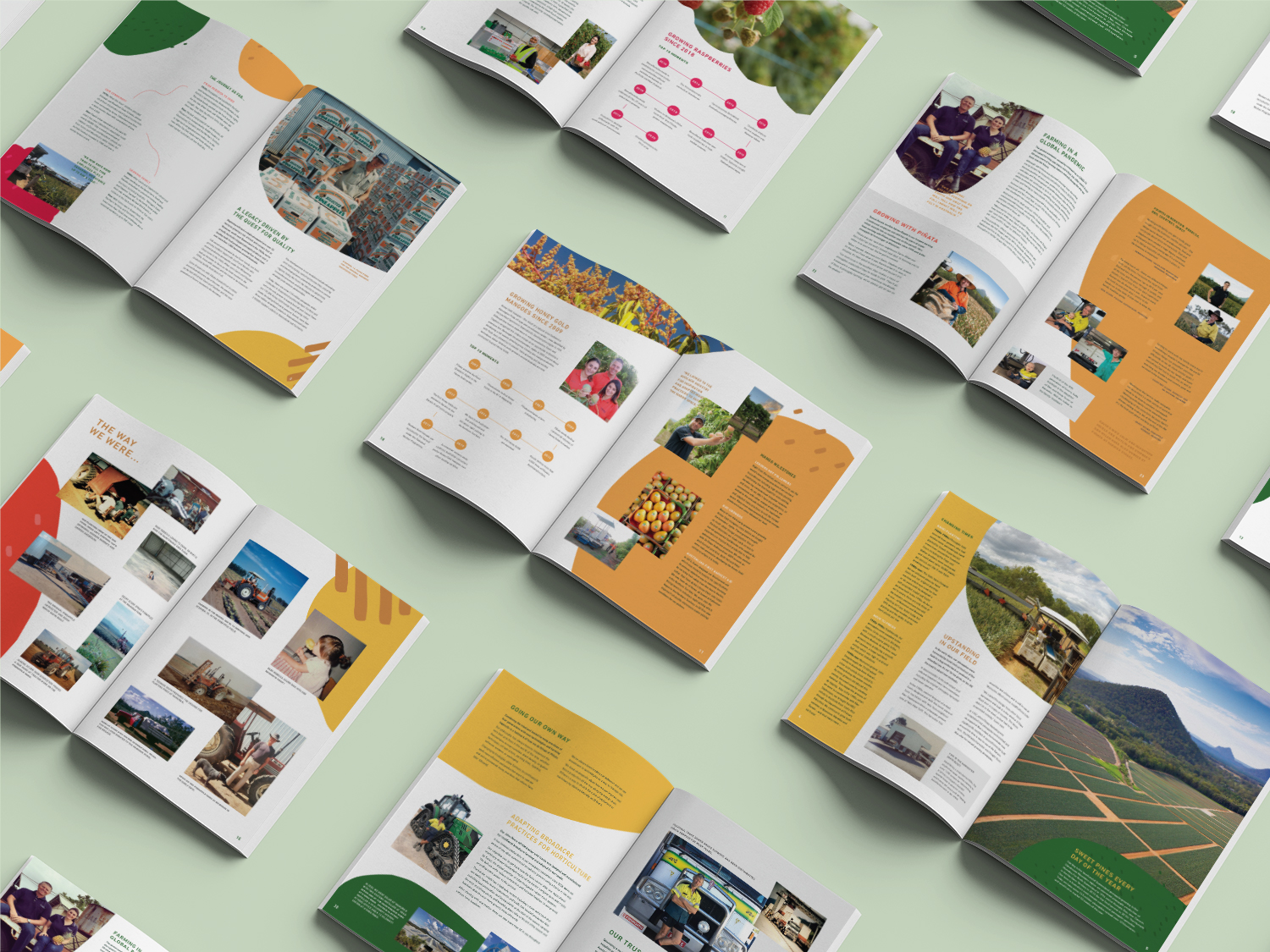
Once we have this information, we will set about designing your Annual Report, utilising imagery, typography, stylised tables, infographics and clever layout choices. We also love a little ‘white space’ (essentially this is breathing room) to help featured typography and quotes stand out. This doesn’t literally mean having areas of blank page, but instead, less cluttered areas to break up the large amounts of text with full-pages of imagery or colour. Your audience will tire quickly of pages and pages of text, so the use of visuals and white space will add interest and give the eyes a chance to rest.

Photography is also a great way to incorporate personality into your Annual Report design, especially if they are natural or professional photos of your work environment. Be sure to avoid low-resolution or obvious stock images, as they can be more detrimental to your brand’s credibility.

The use of these design elements are key to creating impact when getting your message across and will ensure the end result will knock your socks off!

Delivery – print or digital? 

Another important step in the Annual Report design process is to think about how you are going to deliver your report. If you are planning on printing your Annual Report, it’s important to consider paper stock selection and printing methods. Alternatively, if you favour a digital format, videos and click through links can be integrated. The layout structure for print and digital Annual Reports can also differ, so make sure you talk to your designer about options before the design process takes place.

There are many environmentally friendly, recycled paper options available that are economical and still look great – let’s be real; it’s 2016 so this should be important to every business! Printing has come a long way, so don’t be fooled into thinking that you have to use a brown tinted paper to help the environment. You can have a slightly speckled paper or even a bright white if it’s more appropriate for your brand – the options are endless (well almost!).

The word ‘embellishment’ might sound over the top for some corporate clients, but having that “wow factor” can take your Annual Report to the next level and impress those you need to impress! If your budget permits, a foiled logo looks and feels seriously amazing, and is affordable if you intend to print a larger run of copies. Foils aren’t just limited to gold or silver, there are an array of options available and can look particularly smart in black or white, depending on the colour of your Annual Report cover and your brand colours. Another option is to use a Spot UV, which can highlight your logo or brand elements and/or patterns. This is a more affordable way add interest to your cover and impress your stakeholders.

Elements foiled in your brand colour introduce a tactile component that looks corporate and high end. (colouroptions.co.uk)

Die cutting elements to create interest.  (aeportfolio.net)

Example of using a Spot UV to highlight brand elements/patterns. (printechexpress.co.uk)


If you’re all for saving paper and distributing your Annual Report through digital channels, you may wish to consider introducing video elements. In addition,  your PDF can be set up with an interactive contents page, making navigation a breeze.

So remember, content is key, first impressions count, and we’re ready and waiting to help you take your Annual Report design to the next level.

IMAGE CREDITS (top to bottom): 1. CHRC Annual Report, Juno; 2. infographics, praxisadvance.com; 3. Garda Capital tables, Jun; 5. CHRC Annual Report, Juno; Juno Creative has worked on Annual Reports for medium to larger sized company for its clients in Brisbane.