The Project
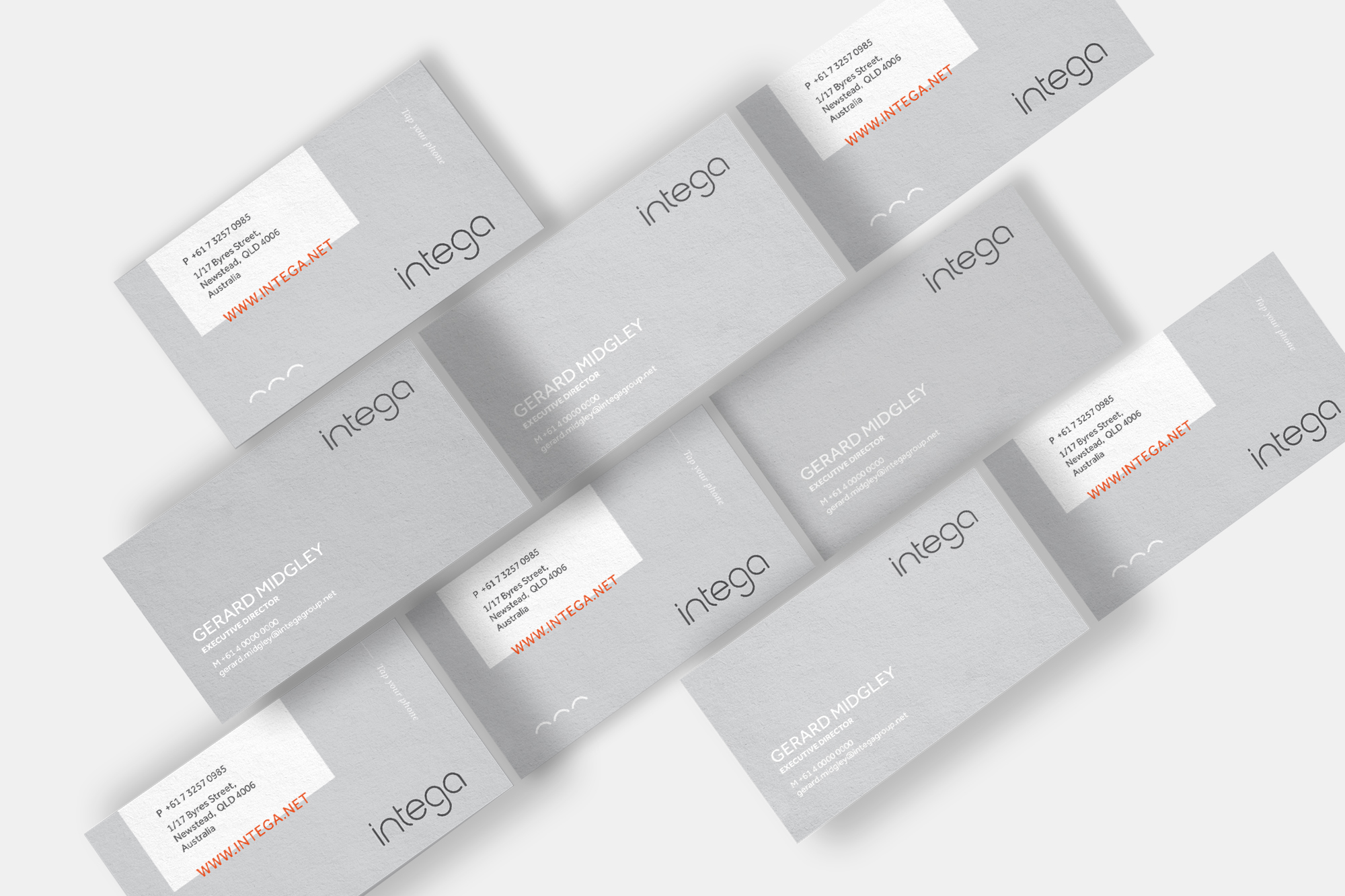
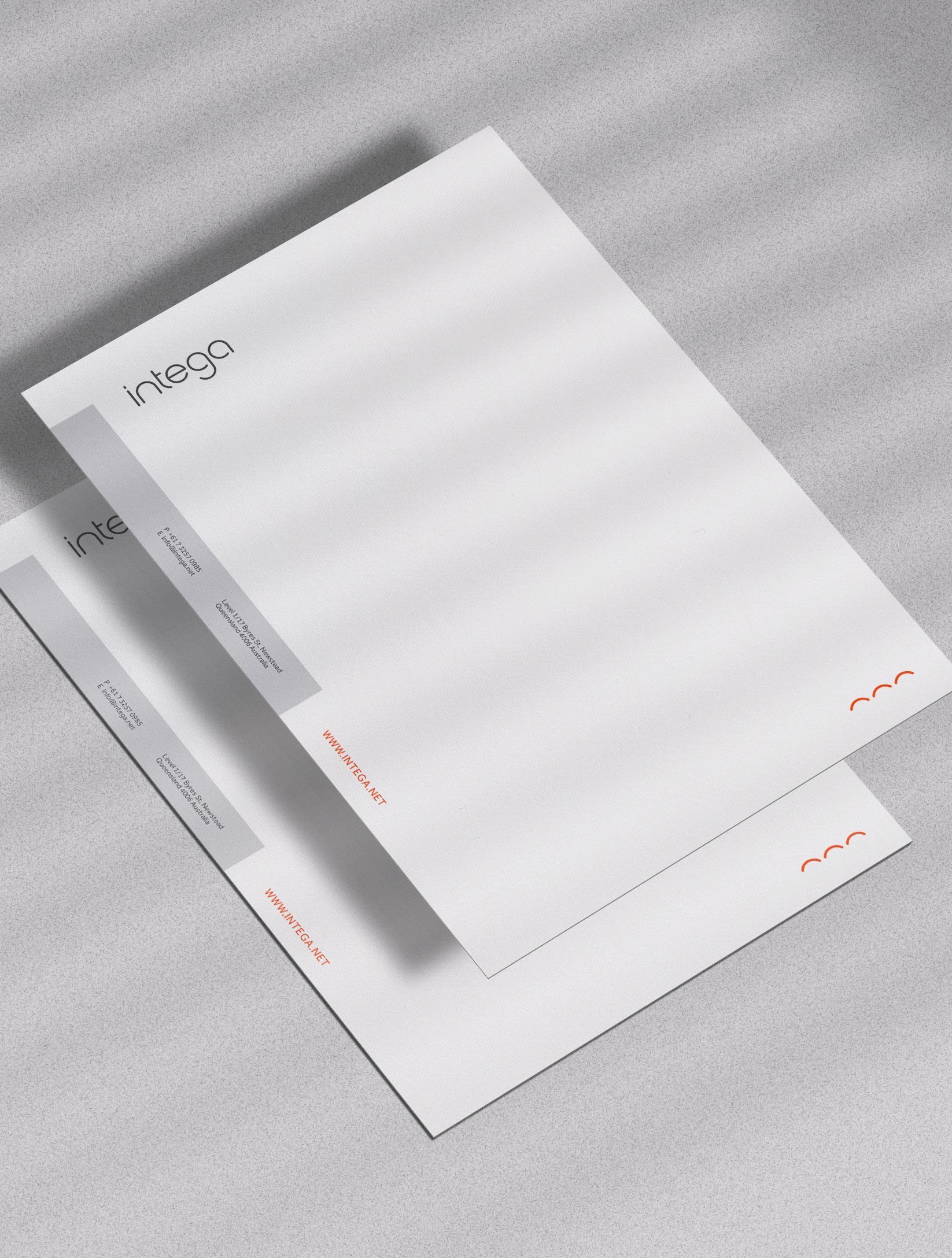
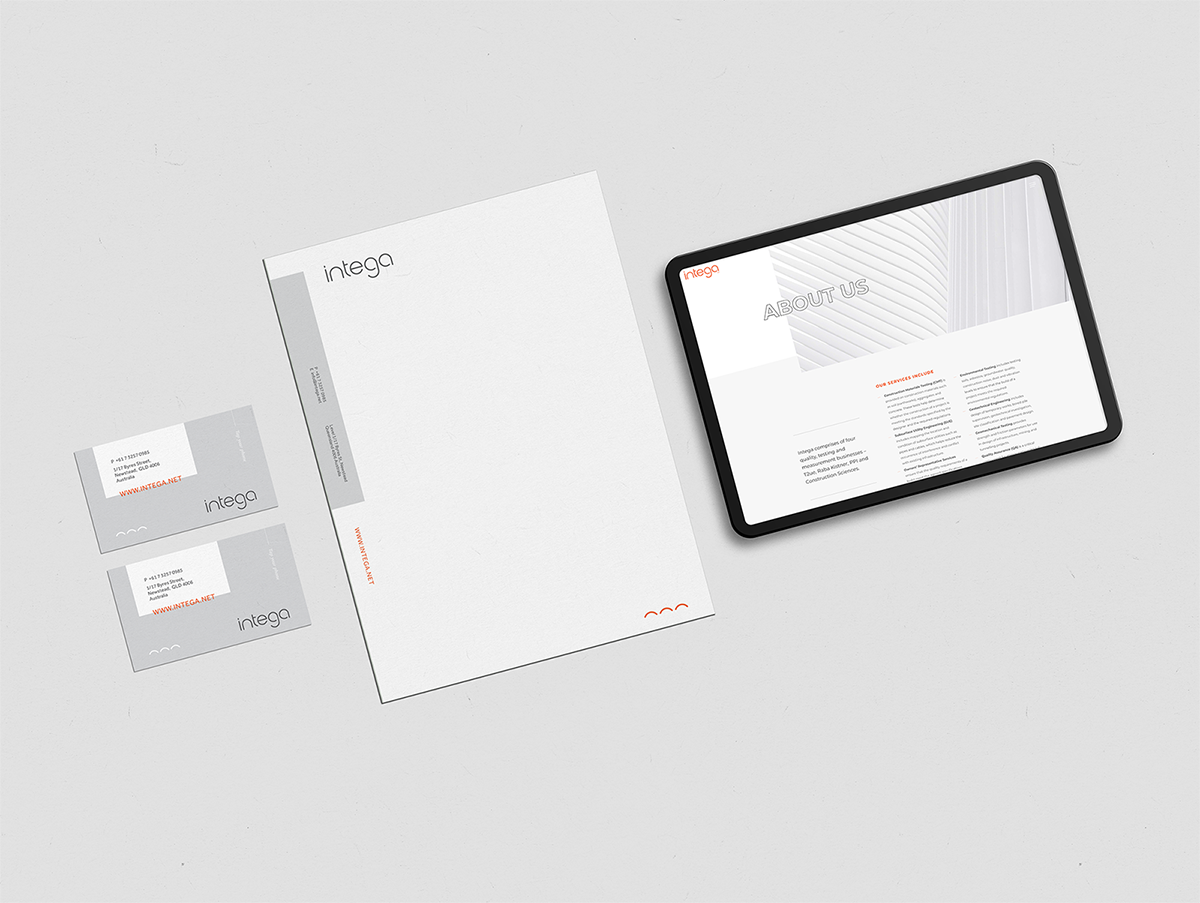
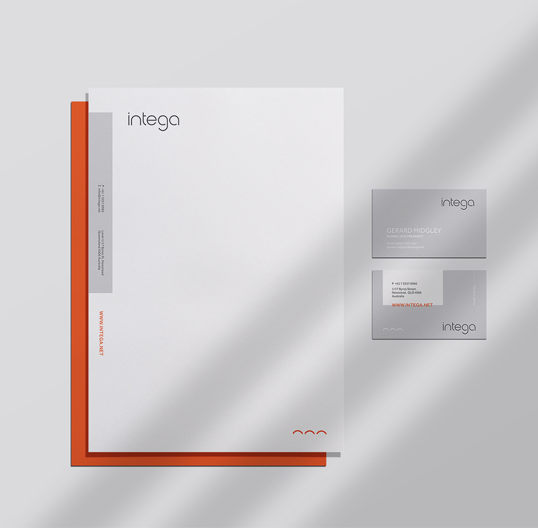
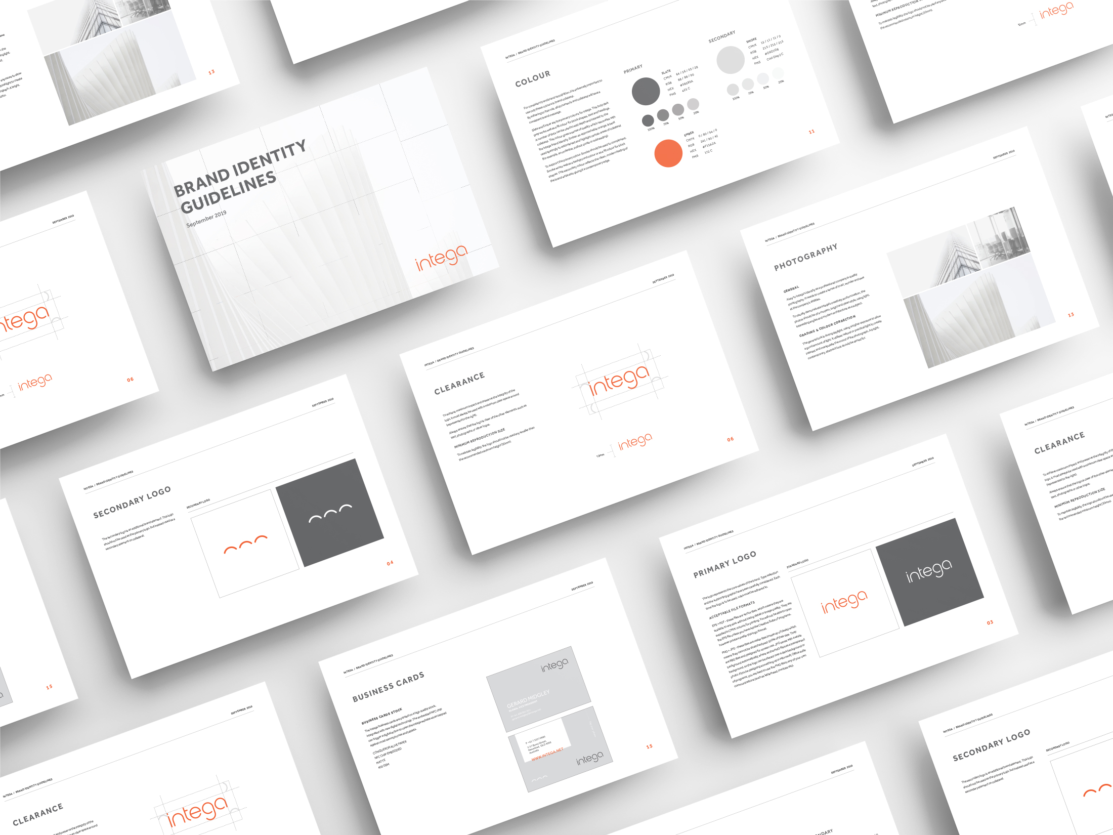
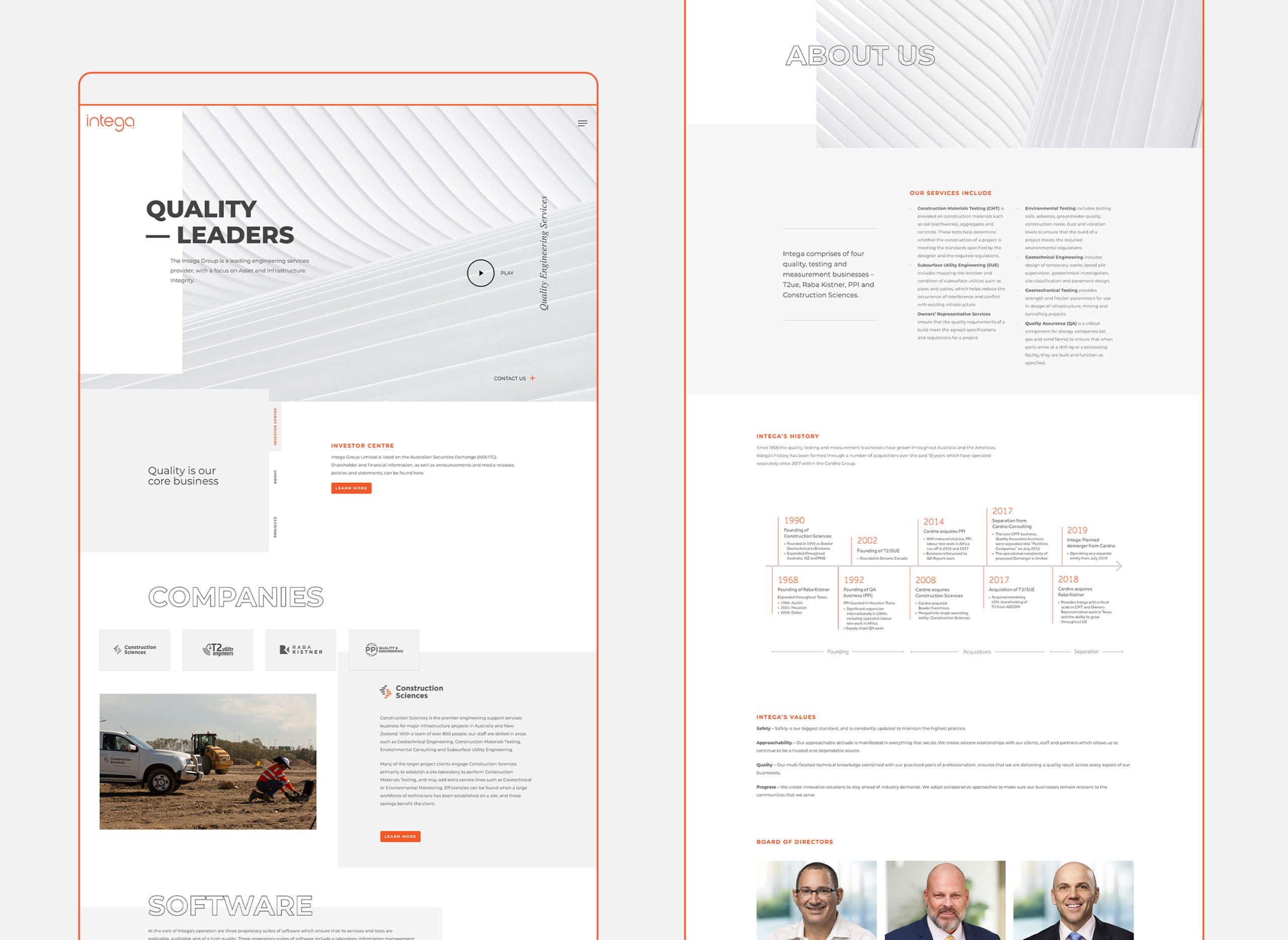
Intega approached Juno seeking a complete rebrand to help solidify their company appearance following their recent demerger. As a quality, testing and measurement business, the new identity had to be modern, fresh and recognisable, while standing for quality and trust.
Juno created the name Intega as a portmanteau of a variety of services provided by the company. By combining the keywords ‘infrastructure’, ‘testing’, ‘engineering’, ‘geo’ and ‘assets’, we were able to form a name that is descriptive and relevant to the business while remaining subtle. The meaning of integer is ‘a whole number’ – relating to Intega by showing that its various sub-brands act as ‘fractions’, coming together to form one unified whole. We also felt that ‘integral’ was an ideal word to use as inspiration – instilling a sense of leadership, dedication and authenticity. The logo construction is balanced in shape, drawing it’s strength from a circle.
View their Juno made website here.
CONTACT US


IMAGINATION FOR SALE
+ BRANDING
+ PRINT MEDIA
LETS CHAT
Kind Words: Sheena Jamieson
“Juno helped us create our new brand from scratch and were great to deal with during the whole process. Paul and his team are very collaborative and pitched us several ideas which we narrowed down to what we felt was the best representation for us. The scope included a new logo, website, stationery, business cards, and style guide and the team was very happy with the end result.”
